| Image |
Comment |
| 07/29/2010 08:30:06 AM |
Xby bspurgeonComment by Tully: It's too bad that neither the fence in the foreground nor the building in the background is sharply in focus. |
 Photographer found comment helpful. Photographer found comment helpful. |
| 07/28/2010 11:21:11 PM |
|
| Photographer found comment helpful. |
| 07/28/2010 11:20:14 PM |
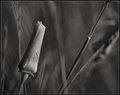
California Poppy #2by bspurgeonComment by Ken: The background does a great job of complementing the main poppy. I like the B&W, it makes me focus more on the flower instead of the pretty colors. |
| Photographer found comment helpful. |
| 07/28/2010 11:18:55 PM |
|
| Photographer found comment helpful. |
| 07/28/2010 11:04:30 PM |
|
| Photographer found comment helpful. |
| 07/28/2010 09:30:55 PM |
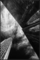
Final Frontier by bspurgeonComment by DrAchoo: I'll end on this shot. The sky is awesome and lends a real sci-fi feel. It's almost as if the building is a large spaceship hovering over a clouded planet. You certainly understand diagonals (as mentioned in my last comment) which is great. This image wants me to imagine a story and explore the possibilities. |
| Photographer found comment helpful. |
| 07/28/2010 09:17:12 PM |
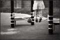
Balanceby bspurgeonComment by DrAchoo: Excellent choice to crop the top half of the girl off. It heightens the tension of the image. The rope is a great leading line between the two vertical pillars. Our eye naturally stops at the ball and then either backs up or skips on to the girl's legs. This is a good example of where a serendipitous composition (you didn't place the posts, ball, rope) really adds to the shot. I'm enjoying your frequent choice of B&W, which is something I lack in my own portfolio. An excellent take on the exuberance (and fears) of youth. |
| Photographer found comment helpful. |
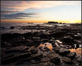
| 07/28/2010 09:11:25 PM |
Something unstoppable set into motion.by bspurgeonComment by DrAchoo: I'm not sure I can agree with the interpretation of the lyric. I can potentially make a connection, but it's far from clear. Of course the title of the song works better than the line chosen. ;) As a landscape, this one lets me down. I feel that too much of the canvas is dominated by the rocky shore. This can normally be good, but in this case the rocks are too similar (yet not similar enough) to give us much interest. I enjoy the left half of the sky, but the right half is, of course, a bit on the blown side. Because of the rocks letting us down, the crop is also off. I would have tried cutting the shot somewhere below the reflective pools. |
| Photographer found comment helpful. |
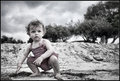
| 07/28/2010 09:06:11 PM |
No Sun Neededby bspurgeonComment by DrAchoo: So I thought I'd head to the middle of your portfolio to find my first comment. After looking at a dozen I stopped here. The natural pose and expression is what makes this images (like you could pose a toddler...). The sand encrusted leg gives us both a candid and snapshot feel. The subdued selective desat works for me. You caught either some artifact or bad bokeh in the tops of the trees which distracts me slightly. In the end it is a shot, perhaps that means the most to the parents who can see all the personality of the child come out in the slightest facial contortion, but it's still an effort that rises above the simple picture of a kid. |
| Photographer found comment helpful. |
| 07/28/2010 12:28:03 AM |
|
| Photographer found comment helpful. |
Home -
Challenges -
Community -
League -
Photos -
Cameras -
Lenses -
Learn -
Help -
Terms of Use -
Privacy -
Top ^
DPChallenge, and website content and design, Copyright © 2001-2026 Challenging Technologies, LLC.
All digital photo copyrights belong to the photographers and may not be used without permission.
Current Server Time: 05/12/2026 11:12:27 PM EDT.