| Image |
Comment |
| 06/25/2007 11:09:31 PM |
|
 Photographer found comment helpful. Photographer found comment helpful. |
| 06/25/2007 10:13:23 PM |
Go Fly a Kiteby sallyjo1Comment by Sheryll: This image looks all awash imo. Try some contrast and work with midtones. Nice composition though and great neg space idea. |
| 06/25/2007 10:25:53 AM |
|
| Photographer found comment helpful. |
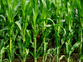
| 06/25/2007 02:30:25 AM |
Child Of The Cornby sallyjo1Comment by boyd2000: camoflaged face through the corn. Good one. I'm wondering if he's standing in a pit? I was thinking of doing a camoflage picture, but didn't have time or materials. |
| Photographer found comment helpful. |
| 06/25/2007 01:04:44 AM |
Child Of The Cornby sallyjo1Comment by hotpasta: I reckon this would have been so much better if you couldnt see his neck and chest...the idea is fantastic though...also, perhaps if he was in some obscure part of the composition rather than smack bang in the middle as he wasn't hard to find...so you went through a lot of trouble, but just a little more thought about composition would have put this in ribbon class...7 |
| Photographer found comment helpful. |
| 06/25/2007 12:06:48 AM |
|
| Photographer found comment helpful. |
| 06/24/2007 04:04:18 PM |
|
| Photographer found comment helpful. |
| 06/22/2007 03:40:19 PM |
Go Fly a Kiteby sallyjo1Comment by cools98: Fit Challenge Criteria: 2/2
Contast/Color: 1/2
Composotion: 2/2
Photo Quality: 1/2
My Personal Affinity: 0/2
You've got the idea of negative space down perfectly. It definitely complements your kite. The colors are a bit dull. The whole photo seems a bit overexposed, leaving the blues in the sky really light, and the clouds without much detail. There also seems to be a fair amount of noise in the photograph. |
| 06/21/2007 10:57:29 AM |
|
| Photographer found comment helpful. |
| 06/20/2007 05:56:13 PM |
|
Home -
Challenges -
Community -
League -
Photos -
Cameras -
Lenses -
Learn -
Help -
Terms of Use -
Privacy -
Top ^
DPChallenge, and website content and design, Copyright © 2001-2026 Challenging Technologies, LLC.
All digital photo copyrights belong to the photographers and may not be used without permission.
Current Server Time: 07/17/2026 12:21:45 AM EDT.