| Image |
Comment |
| 05/13/2006 01:40:18 AM |
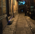
Old Alleyby MartinKempComment by gbautista87: I like the lighting toward the top of the photo. Maybe you could pick a different perspective and include more of it. Maybe you can even have it highlighting something or someone. Also, the lens flare on the left is distracting. One way of preventing that is to shade the lens with your hand, so that light isn't hitting the lens directly. |
 Photographer found comment helpful. Photographer found comment helpful. |
| 05/12/2006 07:36:46 PM |
Old Alleyby MartinKempComment by coolblue: i think that this would have beeb a better picture if the light wasn't
refecting across the step |
| Photographer found comment helpful. |
| 05/12/2006 12:00:20 AM |
Old Alleyby MartinKempComment by dcano: What incredible sharpness in this photo, I keep comming back again and agian to look at it. Great job......... |
| Photographer found comment helpful. |
| 05/11/2006 11:28:36 AM |
Old Alleyby MartinKempComment by jent: only complaint with this photo is the lens flare seems out of place, and distracts from the feeling of the photo. |
| Photographer found comment helpful. |
| 05/11/2006 10:33:20 AM |
|
| Photographer found comment helpful. |
| 05/10/2006 05:14:58 PM |
|
| Photographer found comment helpful. |
| 05/10/2006 09:01:45 AM |
Old Alleyby MartinKempComment by arhunt35: Strange blue light on the left. Other than that quite good. No real interest in it for me and possibly an awkward crop at the top. 6 |
| Photographer found comment helpful. |
| 05/10/2006 07:18:04 AM |
|
| Photographer found comment helpful. |
| 05/06/2006 11:37:16 PM |
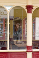
On the Other Sideby MartinKempComment by Prime_Time: *Howdy from the Critique Club*
First of all, this photo is very busy there is all kinds of things going on and to much completion with the main subject. I think you could have cropped from the left of the photo and removed some of the clutter and also this would taken her off center. The colors are ok, but maybe black and white here. I tried this and the green channel seem to make it pop a bit.
Also I would have cloned out the reflection on her face. You might have tried a vignette this would have put more on your subject. These are just ideals, I tried several ways but it was to much Photoshop for me. I did like the repeating lines in the archways. I really have to agree with most of the commenters on this one. I try not to sound harsh that is not the way I am. Also you need to keep your file size close to the 150kb limit, so you don't loose any more image quality. Let me just show a quick redo on your shot and see if you like it any better. Please let me know if you don't want my version of your image online, and I'll take it down.
You have yourself a wonderful day and good luck in furture challenges.
Mark Thomas Kelsay
|
| Photographer found comment helpful. |
| 05/05/2006 08:35:27 AM |
|
| Photographer found comment helpful. |
Home -
Challenges -
Community -
League -
Photos -
Cameras -
Lenses -
Learn -
Help -
Terms of Use -
Privacy -
Top ^
DPChallenge, and website content and design, Copyright © 2001-2026 Challenging Technologies, LLC.
All digital photo copyrights belong to the photographers and may not be used without permission.
Current Server Time: 07/15/2026 05:40:58 PM EDT.