| Image |
Comment |
| 02/06/2003 10:47:39 PM |
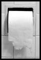
Squared Circleby iraeComment by zadore: ...from Critique Club...
Hi Erik :)
FIRST IMPRESSION:
Greatest invention ever!
COMPOSITION:
Pretty straight forward, but for this challenge I would try to get more of a 'square' feeling to it....maybe just rolling the paper up a bit. :|
TECHNICAL:
Nice soft focus that works for me. lighting is a tad dark, IMO. :|
ARTISTIC:
Very creative. The black and white treatment works nicely. Still not too sure about the square thing :)
OVERALL:
Nice shot, worthy of the final score.
Cheers and good luck in the future challenges. |
| 02/02/2003 09:19:52 PM |
|
 Photographer found comment helpful. Photographer found comment helpful. |
| 02/02/2003 04:58:30 PM |
Squared Circleby iraeComment by jmsetzler: great shot... i really love the concept on this one :) It reminds me slightly of a shot that I have done in the past... I commend you for working with a subject that stirs negative emotion. I don't think I have ever really studied the shape and composition of this scene before.. = 9 - setzler |
| Photographer found comment helpful. |
| 02/01/2003 01:09:31 PM |
Squared Circleby iraeComment by PTLParsons: I LOVE IT!! I especially like the tear of the paper. Feels strange to give toilet paper a score of 8. |
| 02/01/2003 12:10:42 AM |
|
| 01/31/2003 03:50:03 PM |
Squared Circleby iraeComment by karmat: Great sense of humor. Probably more effective, though, if we could see the perforations that make the squares. |
| Photographer found comment helpful. |
| 01/31/2003 12:24:06 PM |
Squared Circleby iraeComment by PaulMdx: Composition: Good
Technical: Nice choice of b&w. Border fits in very well with the black in the pic
Meets challenge: Yes
Overall impression: Pretty faultless. 8 |
| Photographer found comment helpful. |
| 01/31/2003 11:35:36 AM |
Squared Circleby iraeComment by inspzil: All around this seems a little off (pardon the pun). It just doesn't seem square. The paper could be more square than you left it actually. Top of the paper looks like it might be a little washed out. - Inspzil |
| Photographer found comment helpful. |
| 01/30/2003 05:49:45 PM |
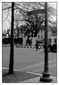
1600 Pennsylvania Ave.by iraeComment by jimmyn4: Greetings from the Critique Club.
I agree. It is too bad about the tree. I'm not sure what time you shot this but the sky looks overexposed to me.
Despite the the trees and sky. I like the framing of this shot. I probably would have waited for the gentleman in the middle to move out of the frame. I'm not sure how much time you had to take the picture as I'm sure you the secret service guys may have been eyeing you down.
I think I am the minority by saying this but I'm not sure I would have gone with the B&W. I know its winter and there's not much color around but because of that I don't see a lot of contrast. An example is the tree on the left. It has nearly the same shade as the bushes and lawn behind it. I think the use of certain filters can bring certain colors out more even in B&W. You can also play around with that stuff in Photoshop as well.
I think the subject is cool. Not everybody can say the share the same address as the president. I hope this helps a little feel free to e-mail me if you have any questions. |
| 01/30/2003 01:16:39 AM |
|
Home -
Challenges -
Community -
League -
Photos -
Cameras -
Lenses -
Learn -
Help -
Terms of Use -
Privacy -
Top ^
DPChallenge, and website content and design, Copyright © 2001-2026 Challenging Technologies, LLC.
All digital photo copyrights belong to the photographers and may not be used without permission.
Current Server Time: 07/15/2026 01:31:30 PM EDT.