| Image |
Comment |
| 01/21/2003 05:19:04 AM |
|
| 01/21/2003 04:56:17 AM |
|
| 01/20/2003 11:05:04 PM |
|
 Photographer found comment helpful. Photographer found comment helpful. |
| 01/20/2003 05:20:47 PM |
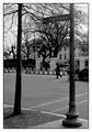
1600 Pennsylvania Ave.by iraeComment by calaille: Picture seems a little too crowded on the top, and open in the bottom. Would shooting this picture from lower balance it out a little more? Looks very sharp though. Good luck! 7 |
| Photographer found comment helpful. |
| 01/20/2003 11:11:50 AM |
1600 Pennsylvania Ave.by iraeComment by bdshort: I like how the tree and sign post frame the white house. I think black and white also works well here, but I've been partial to black and white lately ;) Good shot. 8 |
| Photographer found comment helpful. |
| 01/20/2003 05:53:00 AM |
|
| Photographer found comment helpful. |
| 01/20/2003 02:59:16 AM |
|
| 01/20/2003 01:30:04 AM |
1600 Pennsylvania Ave.by iraeComment by Malokata: Looks awfully dismal, not at all like TV, anyhow. I think this might have been better if you had been standing a bit further to the left, so the pole didn't cut right through the building. How did this look in color? |
| 01/06/2003 12:48:56 AM |
|
| Photographer found comment helpful. |
| 12/23/2002 10:48:56 AM |
Minerby iraeComment by Meggie: cant believe this didnt do better! i gave it a 10 and loved it for its great focud, nice contrast, and originality. nice job ;) |
Home -
Challenges -
Community -
League -
Photos -
Cameras -
Lenses -
Learn -
Help -
Terms of Use -
Privacy -
Top ^
DPChallenge, and website content and design, Copyright © 2001-2026 Challenging Technologies, LLC.
All digital photo copyrights belong to the photographers and may not be used without permission.
Current Server Time: 07/15/2026 09:14:45 PM EDT.