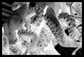
DPChallenge: A Digital Photography Contest You are not logged in. (log in or register
 
Browse Settings
Currently viewing:
Registered Userfacesastheycome

Show comments:

Per page:

Order:

Comments:


Comments Received by facesastheycome
Pages:   ... [51] [52] [53] [54] ... [66]
Showing 501 - 510 of ~658
Image Comment
Dark Past Close
05/08/2006 12:59:22 AM
Dark Past Close
by facesastheycome

Comment by DrAchoo:
Way to be gutsy and use image grain. I wish you could have come up with a better title though...6 for now
Photographer found comment helpful.
The face ( fashion and make up )
05/07/2006 07:28:59 PM
The face ( fashion and make up )
by facesastheycome

Comment by DefyTime:
Great shot for the challenge
Photographer found comment helpful.
The face ( fashion and make up )
05/07/2006 06:33:52 PM
The face ( fashion and make up )
by facesastheycome

Comment by Dr.Confuser:
Nice portrait and I gave it a good score, but has little to do with Photo Journalism IMO.
Photographer found comment helpful.
From outer space
05/07/2006 02:26:07 PM
From outer space
by facesastheycome

Comment by xianart:
Hello, this is christian here, and i'm a new member of the critique club. this is my first critique with the c.c., so at the moment i'm using a format borrowed from others. i hope this is helpful to you, and if you have any questions about what i've said, please p.m. me.

First Impression:
a good strong shot, well composed and nice tonal range.

Composition:
quite good, but with further looking, some weak areas appear. i find the pattern of the roof in the upper left corner rather distracting. it may have worked in positive, but it's not helpful in the negative version. i think if you had cropped the left side to just beyond the start of the poky-out bit (octopus' head?)(i'm pointing at the screen here, just pretend you can see me...)it would be stronger. the large area of blur, again isn't effective in this shot.

i think a crop would focus the viewers gaze, and make it a better image.

the intertwining of the tentacles is very nice indeed

Technical:
the focus is good, crisp and clear. i like the simplicity of the straight inversion - you have a good contrasty shot and that works very well with the negative. one thing, i think it would help the image if the large tentacle on the bottom centre right was darkened just a little where it meets the body of the octopus. it's just a little flat and plain, and detracts from the suckers in front of it. so, if you're in negative, that means you should...dodge the shadow on your positive. had to think for a second there...

i like the rich blacks and bright whites.

My Opinion:
a very strong image, stiking and pleasing to the eye. i didn't vote on this one, i ran out of time, but i probably would have given it a 6. it works well, and immediately catches the eye. the texture and exposure are very nice, and do well together.

well done, and keep shooting. you live in a place of perfect light, lucky you! again, if you have any questions, please do contact me.

cheers,

c.

Message edited by author 2006-05-07 14:29:14.
Photographer found comment helpful.
Pink
05/07/2006 12:33:35 PM
Pink
by facesastheycome

Comment by KaDi:
What great impact this color has! Love the repetition!
Photographer found comment helpful.
Blessed are those who wait
05/07/2006 11:18:57 AM
Photographer found comment helpful.
Blessed are those who wait
05/07/2006 10:40:24 AM
Photographer found comment helpful.
Pink
05/07/2006 07:41:09 AM
Pink
by facesastheycome

Comment by hotpasta:
the black frame adds to this...well done
Photographer found comment helpful.
Nikki
05/07/2006 07:16:33 AM
Nikki
by facesastheycome

Comment by facesastheycome:
The critique much apriciated ,i have ruined my image in playing to much with it ,but hey we learn in every challenge more and more and thats whi i am here thanks to the critique club .
Originally posted by kari1:

::: Critique Club :::

Hi, my name is Kari and from the critique club.

First Impression - the most important one:
Not often in the comments i would say DNMC ... I did that as I felt your model was not framed by the window as well as she could have been.

Composition:
The composition has her head at the very center of the picture .. for this pose this works . .but it will not always be that way .. have you looked into the tutorials on DPC .. their may be some interesting advice there.

Subject:
I think your model is great ... but the challenge was "Frame the subject of your photograph using the window (as in from a building)." with her back framed by the crop and the right side of the picture without a true frame it didn't seem to do this.

Technical (Colour and light):
Black and white was a good choice .. but the grain filter I think got you slaughtered in the scoring. The size of the picture is good but the quality of the picture is lacking and this is probably due to the way you took the pic with the ISO settings etc. Without that information I can't help you.

To grow its vote?:
Thinking outside the box is great .. but still take into account the use of the camera and ensure that you get enough detail in the picture without blowing out the highlights too much.

Summary:
Good shot .. you are doing overwell very well according to your portfolio. look forward to seeing more.

If you've got any questions about this critique, please feel free to contact me via the PM system.

Cheers

Kari
Blessed are those who wait
05/07/2006 02:40:29 AM
Photographer found comment helpful.
Pages:   ... [51] [52] [53] [54] ... [66]
Showing 501 - 510 of ~658


Home - Challenges - Community - League - Photos - Cameras - Lenses - Learn - Help - Terms of Use - Privacy - Top ^
DPChallenge, and website content and design, Copyright © 2001-2025 Challenging Technologies, LLC.
All digital photo copyrights belong to the photographers and may not be used without permission.
Current Server Time: 11/09/2025 07:02:27 PM EST.