| Image |
Comment |
| 12/24/2002 01:56:36 PM |
|
| 12/24/2002 12:00:43 AM |
|
| 12/23/2002 04:54:02 PM |
|
| 12/20/2002 10:02:41 PM |
photographerby blickComment by GeneralE: I'm assuming you left this pretty flat on purpose. I'd like to see it with normal and high contrast too, but this may well be the best approach. You have done an excellent job maintaining detail throughout the entire range. |
| 12/20/2002 07:43:09 AM |
|
| 12/19/2002 03:59:06 PM |
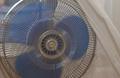
Fanby blickComment by crabappl3: ~~~~Critique Club Comment~~~~
Fan
Composition (Content)
Having the fan off to the side makes for a good setup, but the curtain pulled off to the side and the distraction of what is behind the fan makes it hard to get a feel for the shot. Perhaps having the fan with a black background and having some string tied to it so you can see that they were being blown by the fan would help convey the feeling of motion. As it is now, I can barely see some motion blur in the fan blades and the photo has a lot of distraction around the main subject.
Background
Colors are muted and soft. Looks like a single direct flash was used. Shapes and colors don't draw the attention of the viewer. A less noisy background would help focus the viewers attention on the fan.
Camera Work (Technical)
Fair shutter speed to capture the motion. Perhaps and little longer would help us see the motion of the fan blades. White balance seems off on the curtains as there is no pop with the colors or contrast.
Digital Processing (Technical)
Sharpening is fair( It does not appear to have post processing sharpening done)
Balance between light and dark is fair. ( The whole scene seems flat in color)
Compression is good( No noticeable compression artifacts)
My opinion
I feel that this idea is original enough if properly staged. Either by putting the fan in front of a solid background and opening the shutter longer to see the spinning of the blades, or by showing the motion of the curtain being blown by the fan. |
| 12/18/2002 09:07:49 AM |
photographerby blickComment by PTLParsons: This appears hazy to me. I'd like a little more contrast. I realize you are the expert photographer, but I know what I like to see. To me it's cropped a little to tightly. To me this is a 6. PTL |
| 12/17/2002 08:32:40 PM |
|
| 12/17/2002 03:16:13 PM |
|
| 12/16/2002 03:42:01 PM |
photographerby blickComment by justine: LOL Must be a the blur from the shutter opening and closing........very cool shot. Good work. Like it!!!!!!!!!!! |
Home -
Challenges -
Community -
League -
Photos -
Cameras -
Lenses -
Learn -
Help -
Terms of Use -
Privacy -
Top ^
DPChallenge, and website content and design, Copyright © 2001-2026 Challenging Technologies, LLC.
All digital photo copyrights belong to the photographers and may not be used without permission.
Current Server Time: 07/16/2026 03:52:00 AM EDT.