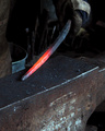
The Smithy's Anvilby
BeeCeeComment by Artyste: Greetings from the Critique Club. My critiques are generally geared towards trying to help you improve your score within DPC, and not on any true "artistic" merit of the photograph itself, unless it relates to DPC voters and scoring. Please keep that in mind as you read this.
Initial Thoughts
A simple, striking image, but lacking something in the DPC vein.
Composition/Content
It's a rare thing indeed to see an old-time metal working happening on the spot, at least for me, so that makes it a little more of an interesting shot as is. However, I feel that it's lacking a litte bit of energy. Just a little too static to really grab the attention of the voter. Had you captured a nice moment of hammer striking, with the sparks/etc, I think it would have given the shot the action/energy that could have propelled it higher in the voting. People tend to like that sort of thing. Compositionally, I think you probably left a little too much space at the bottom. There is some dead area down there that is a little distracting and doesn't really contribute to the overall feel of the shot. Seeing more of the Smith himself could have given the shot a more grounded, emotive feel. You've done well showing the heat of the metal, however.
Background
Nicely OOF, while still showing us the environment. I still think more of the upper part of the photo and less of the lower would give us more impact.
Camera Work/Technical
Great exposure here, but you've mixed up your shutter speed and aperature in your details (just watch for that in the future). Luckily, I know that 1/250 isn't a valid aperature. hehe. I think your choices in-camera worked very well, and gave the shot a good base for your processing.
Digital Processing
Everything looks good. You have no visible processing marks, and everything runs together very nice. Your focus and sharpening are dead-on. (maybe just a *touch* soft). Love the contrast.
Fits the Challenge
While it fits the challenge, I do think that you could have boosted it even more showing some of the action of working the metal. Give the voter some sparks and the energy of hammer hitting iron, and I bet we'd have seen an extra 0.3 to 0.5 in your score. (along with the shift in crop or initial framing)
My Opinion of the Photo
It's a good photo as it stands, and I quite like it. However, I've mentioned some tweaks that I believe could have stood it out even more, and I think it'd be worth thinking about them and noting them for the future. Pay attention to your composition most of all. Beware of dead space, and try to utilize your frame to bring out the best of the photo. In this one, drop the red-hot iron more to the bottom right, give the viewer more of the Smith himself, and throw in a little action/energy, and you'll be able to see the difference.
Good luck in future challenges.