| Image |
Comment |
| 01/27/2003 12:09:56 PM |
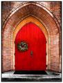
Church Doorby jodiecostonComment by Azrifel: I like the crop, except for the bottom and top, I would like to see less of the dirty pavement and the whole arch in the photo.
The lighting of the stones is nice, but the red of the door is a bit too much.... The corona around the door makes it look unreal. |
| 01/27/2003 10:48:08 AM |
|
 Photographer found comment helpful. Photographer found comment helpful. |
| 01/27/2003 07:33:21 AM |
|
| 01/27/2003 02:06:27 AM |
|
| 01/26/2003 09:45:50 PM |
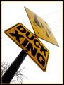
Duck's Eye Viewby jodiecostonComment by PTLParsons: I like the idea of taking the photo at an agle. Just personally don't like this angle. Makes the tope of the ducks sign fade out. Also placement is akward in fame - hard to center it diagonally. |
| 01/26/2003 02:00:55 PM |
|
| Photographer found comment helpful. |
| 01/25/2003 08:27:22 PM |
|
| Photographer found comment helpful. |
| 01/24/2003 09:38:58 PM |
Duck's Eye Viewby jodiecostonComment by Jacko: I like how you filled the entire frame. I'm not crazy about the angle, find it a bit disorienting. Good luck. Jacko. 7 |
| Photographer found comment helpful. |
| 01/24/2003 07:32:51 PM |
|
| Photographer found comment helpful. |
| 01/24/2003 02:05:10 PM |
|
| Photographer found comment helpful. |
Home -
Challenges -
Community -
League -
Photos -
Cameras -
Lenses -
Learn -
Help -
Terms of Use -
Privacy -
Top ^
DPChallenge, and website content and design, Copyright © 2001-2026 Challenging Technologies, LLC.
All digital photo copyrights belong to the photographers and may not be used without permission.
Current Server Time: 07/17/2026 12:32:29 PM EDT.