| Image |
Comment |
| 01/29/2003 03:29:59 AM |
|
| 01/28/2003 08:29:33 PM |
|
| 01/28/2003 07:22:32 PM |
à la plageby paynekjComment by justine: CC:
paynekj<- hello!
---------------------------
Fits The Challenge-Sure does.
Composition-Busy
Background-Beautiful blue sky/beach/ocean.
Digital Processing-I'd of like to see the bottom cropped off shorter. That or just reversed and the bottom lightened up with levels and less sky.
My Opinion-Being dark and busy are the weak areas. Means little to me that my high school French wasn't my best subject. I don't need to know the meaning, I'm smart enough to see one is to the airport and at least one other is to the port. Overall a pleasing shot, just two small areas that could of been changed.
Thanks for the chance to review your photo in Critique Club. Message edited by author 2003-01-28 19:23:29. |
 Photographer found comment helpful. Photographer found comment helpful. |
| 01/28/2003 05:02:26 PM |
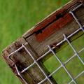
Absent Squares by paynekjComment by bod: Nice colours, focus and use of DoF. Just not an image that really grabs me.
6 for being technically spot on. |
| 01/28/2003 12:27:19 PM |
|
| 01/28/2003 10:20:11 AM |
Absent Squaresby paynekjComment by W.R.Miller: I really like this shot. I really like the crispness of the wood frame and the wire and how you used a large apperature for the very shallow DOF. IMO, this is the best photo of the week. Simple but interesting and definatly meets the challenge.
Thanks!
Bill Miller (wackybill) |
| 01/28/2003 01:26:03 AM |
Absent Squaresby paynekjComment by kiwiness: Wonderful composition, great DOF. Amazing how you can make such a simple object so interesting. 9 from me. |
| 01/27/2003 07:35:52 PM |
|
| 01/27/2003 06:23:06 PM |
|
| 01/27/2003 12:47:21 PM |
Absent Squaresby paynekjComment by dadas115: This is one of my favorites from this week. From looking at the other entries it looks like this is a tough topic to make interesting, but I think you have done a good job with it. I like the color in this picture, particularly the use of contrasting colors between the green OOF areas and the red rust on the wooden frame. You have also made good use of contrast between the darker background and wood frame and the lighter wire mesh. For me the composition is pleasing with the wire squares being off-center. The wooden frame leads my eyes into the picture, but unfortunately it also leads them back out to some extent. This is definitely not a serious problem at all, and I can’t really think of any way to prevent it. The colors look very vivid and pleasing to the eye. The only suggestion I can make for improvement would be to try a wider aperture so you might be able to achieve a smoother bokeh. You have done a good job keeping the wood frame and wire mesh sharp, and I think this will not suffer when using a larger aperture as long as you keep the plane of the sensor parallel to the plane of the wire mesh.
I hope you found this useful,
Greg
|
| Photographer found comment helpful. |
Home -
Challenges -
Community -
League -
Photos -
Cameras -
Lenses -
Learn -
Help -
Terms of Use -
Privacy -
Top ^
DPChallenge, and website content and design, Copyright © 2001-2026 Challenging Technologies, LLC.
All digital photo copyrights belong to the photographers and may not be used without permission.
Current Server Time: 06/11/2026 02:50:51 AM EDT.