| Image |
Comment |
| 05/13/2005 07:37:33 PM |
|
| 05/11/2005 11:54:48 AM |
|
| 05/11/2005 11:43:08 AM |
|
| 05/11/2005 08:36:37 AM |
|
| 04/15/2005 04:23:28 AM |
Kby paynekjComment by paynekj: Thank you for all the kind comments.
gloda wins the prize for getting the explanation of the 550 high correct - I find that anything bigger requires me to scroll, which means the impact of an image is lost.
Kevin |
| 04/14/2005 12:40:59 PM |
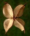
Kby paynekjComment by gloda: Originally posted by legalbeagle:
Why is it 550 high, and not 640 high??? |
So that it fits exactly onto my screen in Firefox :)
A great picture, I was surprised when I read it's a seed, I thought it was a flower! Well, a brown flower... Anyway, it's well executed and very creative. Congrats on your 8th finish. |
| 04/13/2005 06:58:55 PM |
Kby paynekjComment by Matthew: Scored this highly, even though I did not see the "K" until after voting had closed. The "K" is worth looking for here - a deeper, more rewarding picture than many on this front (as well as technically excellent).
Why is it 550 high, and not 640 high??? Waste of 90 pixels of detail vertically, amounting to about 1500 pixels in total, that could have made a significant difference! |
| 04/13/2005 12:23:56 PM |
Kby paynekjComment by Brad: Congrats on your top ten finish Kevin.
This is one that I had to look at twice to see it. Good eye! |
| 04/12/2005 11:53:56 PM |
Kby paynekjComment by mycelium: one of my top five. wonderful colors and DOF. (8) |
| 04/12/2005 11:30:40 PM |
Kby paynekjComment by Kathy: More "X" than "K" (or a perfect capital "J" if cropped down the middle). The uneven lighting is a bit disconcerting, but it's a lovely image nonetheless. |
Home -
Challenges -
Community -
League -
Photos -
Cameras -
Lenses -
Learn -
Help -
Terms of Use -
Privacy -
Top ^
DPChallenge, and website content and design, Copyright © 2001-2026 Challenging Technologies, LLC.
All digital photo copyrights belong to the photographers and may not be used without permission.
Current Server Time: 06/15/2026 03:44:11 AM EDT.