DPChallenge: A Digital Photography Contest You are not logged in. (log in or register
 
Browse Settings
Currently viewing:
Registered Userd14

Show comments:

Per page:

Order:

Comments:


Comments Received by d14
Pages:  
Showing 41 - 50 of ~88
Image Comment
Attack Formation
07/01/2004 03:54:56 PM
Attack Formation
by d14

Comment by Manish Shrivastava:
good capture
Attack Formation
07/01/2004 03:48:42 AM
Attack Formation
by d14

Comment by Node:
Slightly out of focus unfortunatly. Great shot though.
Photographer found comment helpful.
Attack Formation
06/30/2004 02:52:09 PM
Attack Formation
by d14

Comment by bod:
Neat. Spoiled somewhat by the background though - for me it needs to be totally blown out or a fair bit darker.
Photographer found comment helpful.
Attack Formation
06/30/2004 12:32:04 PM
Attack Formation
by d14

Comment by jjenks:
This is so close to an incredible shot (still a great one). If the focus had just been a little clearer... Incredible capture, though. 8
Photographer found comment helpful.
Top Down
06/27/2004 12:52:40 AM
Top Down
by d14

Comment by jadin:
Greetings from the Critque Club!

First let me say I'm not a big fan of this genre in general, so please keep that in mind in my critque.
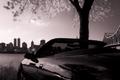
Composition:
I've looked at this photo a long time, and parts I like and parts I don't. As someone mentioned the tree is awkwardly placed, giving the illusion of being in the car. There is too much going on for my tastes, from the reflections in the car, to the skyline, to the tree, to the bridge, all are more or less cut off. It doesn't give me the satisfaction of seeing anything in entirity which is irritating. I can't help but feel your original uncropped is quite a bit better than this version.

What I do like about your composition is the reflection. The tree in the back panel looks as if it could be the tree actually photographed. Which makes for a very cool, surreal "anti-mirror" look.

Lighting:
Your lighting is good. The buildings could be a tad darker, to make them true silohets. Currently part of their details is visible, distracting from your subject (the car). The infared works very well for this photo. It appears normal on first inspection. Only knowing it how you photographed it (and perhaps the tree) give away that it is infared light.

Technical:
Everything is in focus (save movement) due to your aperture. I don't think shortening the depth of field would help any, so I agree with your settings.

Post-processing:
You didn't list any post processing in your comments, so the only thing I can mention is the lighting. Such as the buildings darker for true silohets, or possibly lightening of the car to bring out the detail you know it holds. (for example the mirror is pitch black)

Overall:
This is a pretty good photo, but I can't help but think the original is much better. Perhaps if you chose between the skyline / bridge, and the tree / reflection it would take out some of the distractions. I can just imagine the whole side of the car with reflections on it's shiny paint, and I imagine it'd look good.

All of your other comments enjoyed the photo more than I did, so you must be doing something right :)
Photographer found comment helpful.
Top Down
06/20/2004 08:02:08 PM
Top Down
by d14

Comment by sixmacs:
NICE DOF, neat blurring of the tree.
Photographer found comment helpful.
Top Down
06/19/2004 06:47:58 AM
Top Down
by d14

Comment by Count:
This is a wonderful, awesome picture. Infrared? Looks like it by the leaves. I love the high contrast and smoooooth tones. Also the framing is just great! Top 10.
Photographer found comment helpful.
Top Down
06/18/2004 11:45:16 AM
Top Down
by d14

Comment by Philos:
Nice colors, nice composition
Photographer found comment helpful.
Top Down
06/17/2004 07:25:53 PM
Top Down
by d14

Comment by spydr:
Excellent. Really like the soft focus of the tree
Photographer found comment helpful.
35 Years of Decay
06/17/2004 04:07:27 AM
35 Years of Decay
by d14

Comment by unknowndeath:
You know how to use the angles to attract i give you that but I don't know the lighting is flat. I need to see more of your work to see where its going if your style or just boring shot but you seem to yield good focus and composition. I don't know what I called crappy if I hurt your feelings about something I don't know what it was but maybe that images was for shit.
Photographer found comment helpful.
Pages:  
Showing 41 - 50 of ~88


Home - Challenges - Community - League - Photos - Cameras - Lenses - Learn - Help - Terms of Use - Privacy - Top ^
DPChallenge, and website content and design, Copyright © 2001-2025 Challenging Technologies, LLC.
All digital photo copyrights belong to the photographers and may not be used without permission.
Current Server Time: 08/20/2025 10:49:20 PM EDT.