| Image |
Comment |
| 02/02/2003 06:17:00 PM |
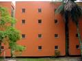
Squaremaniaby pikytoComment by falvey: I like the color and contrast. What if you shot this with only the building v- no veg? |
| 02/02/2003 03:19:27 AM |
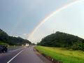
Good sign at the end of the roadby pikytoComment by Natasha: Critique Club
Composition-content
what a great capture of such a beautiful rainbow! Lovely image, until you hit the road, which I understand that you needed to keep to try and fit the challenge, but this would be so nicer without it! I hope that you have done some more crops for yourself, minus the road and concentrating on the rainbow. Composition is nice, with the rainbow coming out of the corner of the shot. i think I would have prefered for the blue car to have been cropped out, but then I suppose you would have lost the road signs, the other sign element in this picture.
Technical
Firstly, I feel that this is a bit tilted, perhaps you could have rotated it a bit to the left. focus is good. Perhaps a little more contrast in colour would have brought out the colours of the rainbow more,and set it off with a darker blue sky-lovely, maybe you can do this minus the road.
My Opinion
Its a lovely shot, doesn't quite meet the challenge, but still a great capture! Good Luck in the next challenge. |
| 02/01/2003 02:25:10 PM |
Squaremaniaby pikytoComment by PTLParsons: You got that right. Looks almost like a prison or hospital. Which ever it is plain and dull. Great find. Photo seems a little light on the left upper corner and a little dark on the right side. Don't know how you could help that except wait on the perfect time of the sun, which may never come. Nice work. |
 Photographer found comment helpful. Photographer found comment helpful. |
| 01/31/2003 11:55:12 AM |
Squaremaniaby pikytoComment by inspzil: The sun above the building is hurting this shot. It's very well taken, but I'm not wild about the composition. There really needs to be some focal point to this pic. - Inspzil |
| 01/30/2003 02:30:43 PM |
Squaremaniaby pikytoComment by PaulMdx: Composition: Seems slightly convex?
Technical: Nice focus/quality. Right tree looks a little dark?
Meets challenge: Yes
Overall impression: Nice colours and a good pic. 6 |
| Photographer found comment helpful. |
| 01/30/2003 02:22:07 PM |
Squaremaniaby pikytoComment by MattW: I like the trees and the range of colors. I also like how all the squares are spaced even on the building. |
| 01/29/2003 08:33:01 PM |
Squaremaniaby pikytoComment by KimInNB: A bit faded at the top. I think a different angle would have made a better photo. Perhaps cropping to the one building (get rid of the division between building sections?). |
| 01/29/2003 10:12:41 AM |
|
| 01/28/2003 01:37:31 PM |
|
| Photographer found comment helpful. |
| 01/28/2003 12:35:07 PM |
Squaremaniaby pikytoComment by justine: Fantastic find, good eye. Wow the color. A better crop would of helped this shot to a ribbon. |
| Photographer found comment helpful. |
Home -
Challenges -
Community -
League -
Photos -
Cameras -
Lenses -
Learn -
Help -
Terms of Use -
Privacy -
Top ^
DPChallenge, and website content and design, Copyright © 2001-2026 Challenging Technologies, LLC.
All digital photo copyrights belong to the photographers and may not be used without permission.
Current Server Time: 07/16/2026 03:56:11 AM EDT.