| Image |
Comment |
| 07/30/2003 01:55:35 PM |
|
| 07/22/2003 04:17:27 PM |
|
| 07/21/2003 09:30:50 PM |
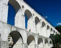
ARCOSby pikytoComment by johnny_justjohnny: you picked a good angle, to catch the shadow cutting under the arches. would like to see a little of the ground though, 'cause it's almost there but not quite, like a picture of someone starting at the ankle. |
| 07/21/2003 03:35:16 AM |
ARCOSby pikytoComment by briphoto: Good lines and colors. I like the white-washed look of the arches. A breath of fresh air compared to some of the other submissions I've been seeing. |
| 07/16/2003 12:43:30 PM |
ARCOSby pikytoComment by justine: Really nice, would of liked to see the left cropped out the house that is seen in the lower left is distracting. |
| 07/16/2003 12:03:40 PM |
|
| 07/15/2003 09:49:53 PM |
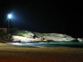
Rio - Light&Magicby pikytoComment by STEINR: if that light on the left were just a little less bright and were ot so prominant this picture would be perfect. |
| 07/15/2003 02:12:37 PM |
Rio - Light&Magicby pikytoComment by Stewan: Waaaaaaay too much light on the boulder/rock. May have looked better with black and white and less lighting |
| 07/14/2003 02:35:37 PM |
Rio - Light&Magicby pikytoComment by MarkS224: I would like it more if it didn't include the light itself and a little less black sky. A thinner landscape format would really make it nice. 6 |
| 07/13/2003 08:27:53 AM |
|
Home -
Challenges -
Community -
League -
Photos -
Cameras -
Lenses -
Learn -
Help -
Terms of Use -
Privacy -
Top ^
DPChallenge, and website content and design, Copyright © 2001-2026 Challenging Technologies, LLC.
All digital photo copyrights belong to the photographers and may not be used without permission.
Current Server Time: 07/15/2026 03:10:03 PM EDT.