| Image |
Comment |
| 07/03/2006 04:43:48 PM |
|
 Photographer found comment helpful. Photographer found comment helpful. |
| 07/02/2006 11:21:21 PM |
|
| Photographer found comment helpful. |
| 07/02/2006 11:11:58 PM |
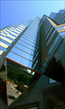
Glass Towersby timfythetooComment by acrotide: Like how the lines of the building move me through this shot. The variety of shapes also make this a great shot for me. |
| Photographer found comment helpful. |
| 07/02/2006 10:58:17 PM |
|
| Photographer found comment helpful. |
| 07/02/2006 10:56:51 PM |
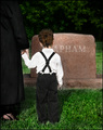
One year later - "Why is daddy still gone?"by timfythetooComment by tngrndream: hello again,
i really liked this photo. you do great work.
only thing i can think of.... unsure it would be better.... is ifn you could see the hair of the woman standing with him. i know that sounds odd.... but i wanna see that she has a head. i am unsure how much it would need to include but i think it would have been a better crop ifn i could see her head a bit. |
| Photographer found comment helpful. |
| 07/02/2006 08:27:28 PM |
|
| Photographer found comment helpful. |
| 07/02/2006 07:47:37 PM |
|
| Photographer found comment helpful. |
| 07/02/2006 02:47:00 PM |
|
| Photographer found comment helpful. |
| 07/02/2006 09:47:33 AM |
Glass Towersby timfythetooComment by hanneke: did you try cropping out the bottom half of your photo? I think that way the buildings would look more "big" |
| Photographer found comment helpful. |
| 07/02/2006 07:32:43 AM |
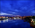
Sixty one secondsby timfythetooComment by chalice: I loved the blues in this photo...and I think the color carries the whole picture. But I had problems with this photo. It seems to me that the focal point is hard to find...is it the boat on the right or the horizon buildings or the sky or the water. I can't tell and my eye is drifting all over this photo - admiring the blue but not able to rest anywhere. Also the buildings and their lights seem out of focus, which is important because my eye wants to rest there...if only because the soft lines in the sky lead down to the buildings and the shoreline on both sides of the picture do the same thing. Perspective seems to draw me to the buildings and their lights, and I am disappointed that they are not crisp. I recognize that I am in the minority in this instance because I voted a 5, even though I wanted to go much higher because of the blues. |
| Photographer found comment helpful. |
Home -
Challenges -
Community -
League -
Photos -
Cameras -
Lenses -
Learn -
Help -
Terms of Use -
Privacy -
Top ^
DPChallenge, and website content and design, Copyright © 2001-2026 Challenging Technologies, LLC.
All digital photo copyrights belong to the photographers and may not be used without permission.
Current Server Time: 07/24/2026 12:45:29 PM EDT.