| Image |
Comment |
| 07/06/2006 12:17:47 AM |
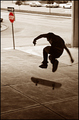
No Skateboarding Allowedby timfythetooComment by Melethia: Trading Post comment
I like the alternate, but I like this one much better. It has a very "skateboard" feel to it - the freedom and singleness that the activity seems to imply. I like the stop sign in red and everything else in brown. That could well be a statement, but it doesn't really say that for me - I just like the tonality of it. In scrolling back and forth to comment, it seems to me you could crop the top just down to where the cars are gone - puts the skateboarder even more into his world. Oh, and don't get hung up on scores - this is actually a pretty darn cool picture that requires more than the standard DPC 2 seconds. |
 Photographer found comment helpful. Photographer found comment helpful. |
| 07/05/2006 09:35:52 PM |
|
| Photographer found comment helpful. |
| 07/05/2006 08:17:27 PM |
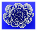
Paper Patterns by timfythetooComment by Gracechild7: An interesting idea, and you have some nice shapes here, but this image is very difficult to look at for more than a moment because the blue is overpoweringly blinding. The boarder seems a little overdone as well. |
| Photographer found comment helpful. |
| 07/05/2006 07:37:34 PM |
|
| Photographer found comment helpful. |
| 07/05/2006 07:04:40 PM |
|
| Photographer found comment helpful. |
| 07/05/2006 07:00:21 PM |
|
| Photographer found comment helpful. |
| 07/05/2006 06:30:49 PM |
|
| Photographer found comment helpful. |
| 07/05/2006 05:43:56 PM |
Paper Patternsby timfythetooComment by philup: This is different, but a good different. Does that make sense??
Back for last bump...every time I look at the picture it gets better. Great job! 10 add to fav |
| Photographer found comment helpful. |
| 07/05/2006 04:12:28 PM |
|
| Photographer found comment helpful. |
| 07/05/2006 03:53:29 PM |
No Skateboarding Allowedby timfythetooComment by DrAchoo: You know what you are doing Tim, so I'll keep this brief. The picture would have scored a great deal better if the stop sign were sharp. I know that's small, but I fully believe if it were sharp you would have had a killer image here. I have it as a rule that if the object has writing on it it needs to be either totally sharp or totally out of focus. The eye HATES blurry writing. Hates it, my friend. You only made it worse with the selective desat drawing attention to the pictures deficit. ;)
Composition is excellent. I love the way the skater appears mainly frozen while the board is what is moving. That's a great touch in my opinion. |
| Photographer found comment helpful. |
Home -
Challenges -
Community -
League -
Photos -
Cameras -
Lenses -
Learn -
Help -
Terms of Use -
Privacy -
Top ^
DPChallenge, and website content and design, Copyright © 2001-2026 Challenging Technologies, LLC.
All digital photo copyrights belong to the photographers and may not be used without permission.
Current Server Time: 07/24/2026 04:55:09 PM EDT.