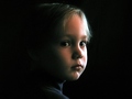
DPChallenge: A Digital Photography Contest You are not logged in. (log in or register
 
Browse Settings
Currently viewing:
Registered Userkashi

Show comments:

Per page:

Order:

Comments:


Comments Received by kashi
Pages:   ... [147] [148] [149] [150] [151] [152] [153] ... [158]
Showing 1491 - 1500 of ~1577
Image Comment
3 months left
09/18/2006 03:37:50 PM
3 months left
by kashi

Comment by kari1:
I looked at the other shot you took on the couch and was a little ho hum .. but this shot I really like ... I like the focus and the natural light ... I think that having the camera higher .. or for you to have looked ahead instead of down may have been slightly more flattering ... both for the lighting and the lines on the facial area.
Photographer found comment helpful.
Seed
09/18/2006 04:18:45 AM
Seed
by kashi

Comment by w4jzz:
I almost didn't catch this. Good visual pun.
Photographer found comment helpful.
Seed
09/18/2006 02:05:54 AM
Seed
by kashi

Comment by BrianR:
Very clever in thought,
Photographer found comment helpful.
Seed
09/18/2006 12:44:59 AM
Seed
by kashi

Comment by skewsme:
thanks for the chuckle ;-)
Photographer found comment helpful.
Contemplative
09/17/2006 10:03:41 PM
Contemplative
by kashi

Comment by bucket:
this is sweet...you have wonderful highlights making this work...
Photographer found comment helpful.
Refreshing
09/11/2006 08:47:50 AM
Refreshing
by kashi

Comment by sherpet:
I am oinclined to agree it is very hard to see the water in the glass. I think the purple colors are just to strong, and maybe in black & white, one may have been able to see the water. In saying that I happen to really like the purplish color tones as an effect.
Photographer found comment helpful.
Contemplative
04/30/2006 01:45:02 PM
Contemplative
by kashi

Comment by fotomann_forever:
::: Greetings from Critique Club :::

Hi, as requested, here is an indepth critique of your submission.

First Impression - the most important one:
Nice low-light portrait. You have a bit of noise (due to low light with a P&S) but overall a good quality portait.

Composition:
Composition is a bit irrelevant to discuss in portraits. As I see it, it either works or it does. Yours does, but I think it'd be a bit stronger if you had moved your subject to the left side of the frame.

Subject:
Clear, in-focus and well isolated from the background. And your lighting has wonderfully isolated the face.

Technical (Color, focus, and light):
Color: color is going a bit green in the shadows. I suspect that is due to the response curve of your camera in low light.
Focus is sharp.
Light: love it! Worked well for you. Only issue I have is the blown highlights in the hair at the right side of the image.

To grow its vote?:
Not actually sure. A bit stronger composition probably would have gotten you over the 6 mark as would the blown highlight area. But overall, there was some tough competition in the upper-ranks with a lot of expensive equipment.

Summary:
Well done portrait. Definitely a keeper.

To answer your question about banding: It is usually an artifact of having a large gradiant of colors. Banding is when the gradient does move smoothly from one shade to another and starts to visually seperate. I can't agree with crayon, I don't see it happening in your image. I think what he is seeing is difference in lighting that he assumes is banding. I say that because I don't see any distinct lines between shades of colors.

To see what I'm talking about try putting a posterization adjustment layer over the image and notice how the colors start to seperate.

Hope that helps and hope to see more from you soon,
Leroy
Photographer found comment helpful.
Contemplative
04/25/2006 06:49:37 AM
Contemplative
by kashi

Comment by dolphnz8:
Great job Kashi. See, everyone told you to keep shooting and keep shooting...the natural juices will eventually syart to flow!
Photographer found comment helpful.
Contemplative
04/24/2006 05:34:54 AM
Contemplative
by kashi

Comment by kashi:
Originally posted by crayon:

seems to be some banding (whatever they call it) on the child's face.
Could have been removed with softening. But if grain is what you are after, there isn't enough in the photo to make it obvious - the one on this photo looks more accidental than purpose. cheers. 8


What is banding ?
Contemplative
04/23/2006 10:13:07 PM
Contemplative
by kashi

Comment by Prime_Time:
I really like the shot and the set up, just seems like the light is a touch on bright side.
Photographer found comment helpful.
Pages:   ... [147] [148] [149] [150] [151] [152] [153] ... [158]
Showing 1491 - 1500 of ~1577


Home - Challenges - Community - League - Photos - Cameras - Lenses - Learn - Help - Terms of Use - Privacy - Top ^
DPChallenge, and website content and design, Copyright © 2001-2025 Challenging Technologies, LLC.
All digital photo copyrights belong to the photographers and may not be used without permission.
Current Server Time: 06/25/2025 11:22:51 AM EDT.