| Image |
Comment |
| 03/06/2007 11:03:22 PM |
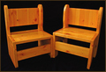
Almost Identicalby kashiComment by Shadowi6: Nice shot but it looks very plain, perhaps a bit too red in the colours and the background is just too boring imo. Good Focus thou Good Luck |
 Photographer found comment helpful. Photographer found comment helpful. |
| 03/06/2007 11:45:21 AM |
Evening Treeby kashiComment by jaysonmc: A good attempt Kashi. I do like the blue color cast you managed to capture along with the idea as I am a big fan of silhouettes. While everyone is suggesting to include the whole tree which would improve the composition, the other thing you could try is being directly under the tree looking up. This way you get the branches spreading evenly over the frame in different directions.
The angle you shot at is a tough one, generally it is good if you want to show a sense of scale, however there is no subject reference to give it this feeling as such it loses a bit. As an example, with this angle what would really help would to have a color contrasting object (bright white or something else) that is small in the lower right corner on one of the branches.
Just some ideas, but I am not really saying this picture is bad. The idea is great and silhouettes with textured patterns are always a winner. Hope that helps, feel free to critique me anytime! |
| Photographer found comment helpful. |
| 03/06/2007 09:11:49 AM |
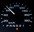
KM/Hby kashiComment by Melethia: I was about to scold your for shooting while driving until I read your comment! Good, clean shot, depicted the acronym well. The light indicating "Drive" is a tad overbright, maybe. |
| Photographer found comment helpful. |
| 03/05/2007 08:03:53 PM |
Evening Treeby kashiComment by bmartuch: I agree with Catherine, I think you needed to show more of the tree. Right now it just seems like something is missing. I think the color of the sky helps create and interesting silhouette. |
| Photographer found comment helpful. |
| 03/05/2007 06:09:48 PM |
|
| Photographer found comment helpful. |
| 03/05/2007 04:58:15 PM |
|
| Photographer found comment helpful. |
| 03/05/2007 12:45:11 PM |
KM/Hby kashiComment by kashi: Originally posted by bmartuch:
I thought you did a good job on this. I'm surprised your score wasnt' higher than it was. Nice work. Go D50. |
Thanks.
Should be getting the D50 tomorrow. |
| 03/05/2007 12:42:09 PM |
KM/Hby kashiComment by bmartuch: I thought you did a good job on this. I'm surprised your score wasnt' higher than it was. Nice work. Go D50. |
| Photographer found comment helpful. |
| 03/05/2007 12:54:53 AM |
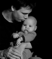
Boyby kashiComment by jaysonmc: Hi Kashi! Yes, definitely low light usage going on here. Not sure about the element in the bottom right corner, though I do like the slight touch in the top right corner (curtain/window?). Cute expression and a nice side profile. |
| Photographer found comment helpful. |
| 03/05/2007 12:26:18 AM |
Almost Identicalby kashiComment by hotpasta: I want to be kind here but...
This is the kind of image you should use on EBay if you were selling these lovely pieces of furniture. There is nothing creative or interesting about your shot at all. Lighting is OK and the black background suits
sorry :-( |
| Photographer found comment helpful. |
Home -
Challenges -
Community -
League -
Photos -
Cameras -
Lenses -
Learn -
Help -
Terms of Use -
Privacy -
Top ^
DPChallenge, and website content and design, Copyright © 2001-2026 Challenging Technologies, LLC.
All digital photo copyrights belong to the photographers and may not be used without permission.
Current Server Time: 06/03/2026 09:31:43 PM EDT.