| Image |
Comment |
| 06/17/2003 04:16:44 PM |
|
| 06/12/2003 01:25:18 AM |
|
| 06/11/2003 08:56:07 PM |
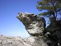
The Edge of Eternityby dasein06Comment by GinaRothfels: I'd really have liked to see a bit of background scenery in the distance. Of course it may not have been safe to get any closer - it's not worth risking your life for a photo. |
| 06/11/2003 03:41:40 PM |
The Edge of Eternityby dasein06Comment by RiderGal: Personally I do not consider magazines to be in a horizontal shape... thats just me though. What is the edge of eternity magazine? Not sure what it's about and can't find it on Yahoo. I'm not doubting that it is indeed a magazine but I have no reason to know what the magazine is about and if your photo does indeed fit for the magazine. Sorry. |
| 06/11/2003 02:56:05 AM |
|
| 02/23/2003 11:50:45 AM |
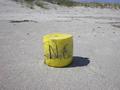
lostby dasein06Comment by tcherring: This photo looks like it belonged on the set of Cast Away! I love it, it really does look "lost"! |
| 02/22/2003 09:02:50 AM |
lostby dasein06Comment by 'Pong: About the composition, I would try 1/3 to give the frame more space and relate to the title. |
| 02/20/2003 04:18:42 PM |
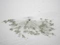
Are You There?by dasein06Comment by crabappl3: Critique Club Comment:
Try as I might, I do not see a 'waldo' in this picture. Being that the subject of the contest was to hide person in an otherwise personless photo, I think you hid him to well. That being said, the rest of the photo doesn't really grab my attention. The focal point is the hole in the absolute center of the frame. The dirt pattern is interesting but not enough to have your viewers attention captured. Lighting and focus are good as well as post processing compression and sharpening.
Keep submitting and keep shooting! I see this is your first entry... Glad to have you on board! |
| 02/20/2003 12:36:28 AM |
lostby dasein06Comment by thatguy: good image, the yellow bouye seems small compared to the background and the background also seems a little cluttered |
| 02/18/2003 10:16:43 AM |
lostby dasein06Comment by Amiee: I think adding this object to the photo sort of ruins it. It makes the object look totally out of place. The photo needs to be more natural looking. But it very clear and colorful. |
Home -
Challenges -
Community -
League -
Photos -
Cameras -
Lenses -
Learn -
Help -
Terms of Use -
Privacy -
Top ^
DPChallenge, and website content and design, Copyright © 2001-2026 Challenging Technologies, LLC.
All digital photo copyrights belong to the photographers and may not be used without permission.
Current Server Time: 07/15/2026 05:30:57 PM EDT.