| Image |
Comment |
| 06/30/2006 09:54:37 PM |
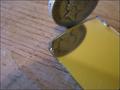
Shallowby _fred_Comment by dg56: Would have been nicer if the image in the mirror was clear. |
 Photographer found comment helpful. Photographer found comment helpful. |
| 06/30/2006 10:57:56 AM |
Shallowby _fred_Comment by Jaded_Housewife: I would prefer focus be on the reflection and shard of mirror rather than the coin. that would have made this much better i think. |
| Photographer found comment helpful. |
| 06/30/2006 12:44:20 AM |
Shallowby _fred_Comment by Matt414ce: Using a full mirror, I think, would have improved this shot. The wood grain is distracting, and the wood surface doesn't seem to be very clean either. I like the DOF and perspective. |
| Photographer found comment helpful. |
| 06/29/2006 12:18:42 PM |
Shallowby _fred_Comment by LalliSig: I don´t know why but it bothers me that you have all that space to the left and then don´t include the whole coin in the frame, just don´t think it "looks right" sort of. |
| 06/29/2006 12:56:09 AM |
|
| 06/24/2006 04:41:59 AM |
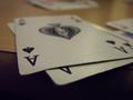
Aceby _fred_Comment by Judi: Now this is close work. But well done all the same. |
| Photographer found comment helpful. |
| 06/22/2006 03:05:20 PM |
Aceby _fred_Comment by cconlin: good vanishing point, I wonder what game they're playing? nice take! |
| Photographer found comment helpful. |
| 06/22/2006 07:44:27 AM |
|
| Photographer found comment helpful. |
| 02/21/2006 06:51:01 PM |
Prideby _fred_Comment by byrongates: There is a small ring on the lenes where you adjust the focus. Next time please use it. |
| 02/21/2006 02:55:26 PM |
Prideby _fred_Comment by Kevin Waite: Too out of focus. The crop would have been much better a little tighter on the top, to get rid of the light color up there. Just my opinion :) |
| Photographer found comment helpful. |
Home -
Challenges -
Community -
League -
Photos -
Cameras -
Lenses -
Learn -
Help -
Terms of Use -
Privacy -
Top ^
DPChallenge, and website content and design, Copyright © 2001-2026 Challenging Technologies, LLC.
All digital photo copyrights belong to the photographers and may not be used without permission.
Current Server Time: 07/16/2026 01:30:18 AM EDT.