| Image |
Comment |
| 05/07/2007 03:09:45 PM |
Day 07by darnokComment by dreamy: Love the simplicity and in the same time the perfect execution of this shot |
 Photographer found comment helpful. Photographer found comment helpful. |
| 05/07/2007 11:01:05 AM |
Sundownby darnokComment by SteveJ: Hi, from the Critique Club,
Triptych throws up some good photos and tell some good stories.
Composition is pleasing, but I feel you missed an opportunity by using a single exposure and dividing it. Perhaps with slight rearranging of the elements it would have worked better.
Technically it is well taken photo with good lighting. The graduated sky looks great and the clouds give it an extra element. The choice of image sizes gives a nice balance with the borders and I think the white line in the borders works.
Overall, I think it slightly misses the true meaning of a Triptych which is usually three individual images combined to make a story. This is why I suggested perhaps moving elements into a different order. The tower element would have been better as the first part and then the other two as they appeared, but this is just my opinion, by doing this it would taken away the obvious fact that this was created from just one exposure. However, I feel it scored at about the right point in the challenge, it is a compotent submission with some nice details. Well done. |
| Photographer found comment helpful. |
| 05/07/2007 10:36:54 AM |
|
| Photographer found comment helpful. |
| 05/06/2007 11:18:32 PM |
|
| Photographer found comment helpful. |
| 05/06/2007 07:41:46 PM |
Day 04by darnokComment by colorcarnival: i think it is a beautiful thing to see the rays of the sun streaming past the clouds. the tree adds a nice element to the pic as well. |
| Photographer found comment helpful. |
| 05/06/2007 03:26:35 PM |
Day 06by darnokComment by violinist123: You did come up with a decent idea.
I like the stark difference between lights and darks here with very little transition. I sort of wish there was a balance between the two, say by moving the apples to the left a bit and letting the whitespace get equal real estate in the frame. Details on the apples, where present, adds just enough texture to keep the shot from being boring. |
| Photographer found comment helpful. |
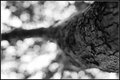
| 05/06/2007 02:25:42 PM |
Day 01by darnokComment by idp: Nice shot - like a band of focus on the tree - almost liker a ring
|
| Photographer found comment helpful. |
| 05/06/2007 01:19:09 PM |
Incomingby darnokComment by Haneck: Very awesome capture! The composition is also great, and the colors beautiful. |
| Photographer found comment helpful. |
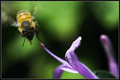
| 05/06/2007 01:05:06 PM |
Day 05by darnokComment by sevilduvarci: very nice capture. i like the motion blur on his wings, gives the feeling of busy bee really. |
| Photographer found comment helpful. |
| 05/06/2007 07:25:32 AM |
|
| Photographer found comment helpful. |
Home -
Challenges -
Community -
League -
Photos -
Cameras -
Lenses -
Learn -
Help -
Terms of Use -
Privacy -
Top ^
DPChallenge, and website content and design, Copyright © 2001-2026 Challenging Technologies, LLC.
All digital photo copyrights belong to the photographers and may not be used without permission.
Current Server Time: 07/26/2026 01:10:30 PM EDT.