DPChallenge: A Digital Photography Contest You are not logged in. (log in or register
 
Browse Settings
Currently viewing:
Registered Usermoniepenny

Show comments:

Per page:

Order:

Comments:


Comments Received by moniepenny
Pages:   ... ...
Showing 261 - 270 of ~314
Image Comment
Reflecting
04/30/2006 03:51:35 PM
Reflecting
by moniepenny

Comment by trnqlty:
Good eye for the color
Photographer found comment helpful.
Reflecting
04/30/2006 11:30:48 AM
Reflecting
by moniepenny

Comment by szalona:
meets thechallenge and nice photo. 7.
Photographer found comment helpful.
Reflecting
04/30/2006 10:44:50 AM
Reflecting
by moniepenny

Comment by ClubJuggle:
Good entry, meets the challenge but needs a slight CCW rotation.
Photographer found comment helpful.
Reflecting
04/29/2006 10:13:57 PM
Reflecting
by moniepenny

Comment by 2mccs:
beautiful orange and blue in the water on both sides of the dock but the dock and person take away from the picture
Photographer found comment helpful.
Kaleidoscope
04/29/2006 03:54:43 PM
Kaleidoscope
by moniepenny

Comment by fotomann_forever:
::: Greetings from Critique Club :::

Hi, as requested, here is an indepth critique of your submission.

First Impression - the most important one:
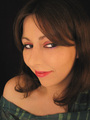
If I had such a lovely model standing in my mirror, I'd never use anyone else ;-)

Seriously, I thought it was a very good portrait. Loved the eyes. I only wish you had applied a bit more USM after resize.

Composition:
Works well. It's tight, but not so tight it makes me feel closterphobic. I think it is bold and "in-your-face". It deifinitely brings attention to your lovely eyes. (ok, I will "try" to quit flirting) :-)

Subject:
Usually, in a portrait, the subject is the person posing. I think you've gone as far as perhaps making your eyes the subject of the image. That's what I'm getting, anyway. The framing of the hair has really brought attention to them.

Technical (Color, focus, and light):
Color looks good to me. But may be just a little flat. Might want to be a bit more agressive with the curves.

Focus: A tiny bit soft, but perhaps just needed a bit more USM in post.DoF might have been just a bit too shallow also.

Lighting: Also, just a bit flat, but with the more agressive curve would have popped a bit more.

To grow its vote?:
A few technicals perhaps held you down. You beat me and portrait photography is what I do.

Summary:
[flirt on] Stunning, beautiful self-portrait. You can't pay for much prettier models. Those eyes kill me.[/flirt off]

I'm with Yanko and eschalar, this was highly under-rated. But, a few technicals could have popped you up a point or two. I think you did a great job, using a P&S.

[firt on]Here's to hoping we see more self-portraits from you :-) [/firt off again].

oh BTW:

Originally posted by moniepenny:

Edit: Well I didn't get it. Oh well. I'm wondering how the face is distorted though, I just don't see it...also I have a p&s, so wide angle isn't really a choice.


I believe the "distortion" is a bit of misunderstanding of your uniquie PoV. Some might not like the "in-your-face" short focal length, close camera PoV.

Generally, portraits are shot with a less-wide zoom than you have used.

Hope to see more from you soon,
Leroy

Edit: for typos.

Message edited by author 2006-04-29 16:00:43.
Photographer found comment helpful.
Bandit
04/29/2006 12:09:45 PM
Bandit
by moniepenny

Comment by Sunshine86:
Cute. I really liek the perspective.
Photographer found comment helpful.
Reflecting
04/29/2006 09:39:41 AM
Reflecting
by moniepenny

Comment by dw_photo:
interesting
Photographer found comment helpful.
He Waited.
04/29/2006 05:19:17 AM
He Waited.
by moniepenny

Comment by gloda:
An excellent idea for this challenge. The setting is quite cool for this shot, it looks like a down-to-earth (pun) appartment, but the lighting gives it that heavenly shine. I think the woman's pose is bad though. Maybe it's just her dress, but she seems somewhat bulky and bored.
Photographer found comment helpful.
Chuck
04/29/2006 05:16:22 AM
Chuck
by moniepenny

Comment by gloda:
Your post processing echoes the mood of the image very well. I get a sense of independence, rejection of limitation from the abandoned shoes and the writing in the sand. I almost mistook the star for a pentagramm though :)
Photographer found comment helpful.
Reflecting
04/29/2006 03:32:25 AM
Reflecting
by moniepenny

Comment by Rikki:
Lovely silhouette but I seem to fail to see the compliments.
Photographer found comment helpful.
Pages:   ... ...
Showing 261 - 270 of ~314


Home - Challenges - Community - League - Photos - Cameras - Lenses - Learn - Help - Terms of Use - Privacy - Top ^
DPChallenge, and website content and design, Copyright © 2001-2025 Challenging Technologies, LLC.
All digital photo copyrights belong to the photographers and may not be used without permission.
Current Server Time: 08/24/2025 02:36:19 PM EDT.