| Image |
Comment |
| 08/25/2006 03:41:00 PM |
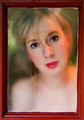
Come Homeby scarbrdComment by Rino63: the shot is good, ok the frame and the treatment on the glass interesting, like the colours and the composition. the model expression.... it does not convince to me. why the title come home? to who one addresses that words? isn't obvious if she call a son, or the husband or other people. I am very incertain for the rating......I rate the photo with 7 but I shall think.
best regards |
 Photographer found comment helpful. Photographer found comment helpful. |
| 08/25/2006 12:23:05 AM |
|
| Photographer found comment helpful. |
| 08/24/2006 11:34:30 PM |
Come Homeby scarbrdComment by magnus: Wonderful idea. I'd prefer a little less eye-liner, but otherwise this is excellently done. |
| Photographer found comment helpful. |
| 08/24/2006 04:35:56 PM |
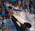
. . . Yet Spectacular!by scarbrdComment by aimeethetoo: Not sure why many did not see that this is at least a tiny bit "stupid". IMO this could be considered stupid on several levels. After all, this woman is letting a massive beast toss her through the air - risking life & limb. It's sort of the same kind of stupid as the circus guy who puts his head in the mouth of a lion. Well done and sorry about the DNMC nazi's - still - top 30 ain't bad! Message edited by author 2006-08-24 16:37:54. |
| Photographer found comment helpful. |
| 08/24/2006 03:58:13 PM |
Come Homeby scarbrdComment by posthumous: great way to fulfill the challenge. lovely frame, you even have two streaks representing tears. great blank yet emotive gaze from the model. 9 |
| Photographer found comment helpful. |
| 08/24/2006 03:07:45 PM |
Come Homeby scarbrdComment by rox_rox: I really like this! The red window frame really works; especially because the red is picked up by the lipstick. Very emotive and soulful expression. Interesting and creative approach to challenge definition.
Edit: spelling Message edited by author 2006-09-01 18:45:49. |
| Photographer found comment helpful. |
| 08/24/2006 11:14:11 AM |
Come Homeby scarbrdComment by redmoon: technically i like this a lot; from the thumbnail it didn't look all that promising, but upon viewing the image you really do get to see the nice intricacies. i love how you are utilising the frame so effectively, and using the water on the glass as a way to generate the softness in the picture. the things that don't really sit right is the amount that is too out of focus, basically the stuff going on below her nose. i think if she wore something it might have given more definition for shapes and colour. and i don't know, i feel i need to see a hand somewhere? i like that part of the moisture is wiped away for her to see (nice touch that). i don't like how her lipstick really clashes with the wood of the frame. but overall, this is creative, inventive and likeable! 7. |
| Photographer found comment helpful. |
| 08/24/2006 03:09:17 AM |
|
| Photographer found comment helpful. |
| 08/23/2006 10:17:39 PM |
|
| Photographer found comment helpful. |
| 08/23/2006 09:39:13 PM |
|
| Photographer found comment helpful. |
Home -
Challenges -
Community -
League -
Photos -
Cameras -
Lenses -
Learn -
Help -
Terms of Use -
Privacy -
Top ^
DPChallenge, and website content and design, Copyright © 2001-2026 Challenging Technologies, LLC.
All digital photo copyrights belong to the photographers and may not be used without permission.
Current Server Time: 06/19/2026 02:23:39 AM EDT.