| Image |
Comment |
| 03/31/2007 08:23:42 AM |
|
 Photographer found comment helpful. Photographer found comment helpful. |
| 03/31/2007 08:00:49 AM |
|
| Photographer found comment helpful. |
| 03/30/2007 11:49:49 PM |
Tops!by freakin_hilariousComment by citymars: A low score from me. I think some color might have added visual interest. The only sharp thing in the photo is the lower left corner and mabe the center peg on the front spinner. The empty space glares in the center and upper right. |
| Photographer found comment helpful. |
| 03/30/2007 08:47:48 PM |
|
| Photographer found comment helpful. |
| 03/30/2007 05:29:48 PM |
See what I'm sayin'?by freakin_hilariousComment by Nuzzer: Greetings from the Critique Club
Composition: The composition is good but I feel you are a little close to the right side for comfort. I also wonder if the way the letters curve up to the top of the frame isn't causing an unnatural line in the image - I say this because my eye is drawn from you out to the "H", which is taking me away from the model.
Technicals: The lighting is good, maybe the backlighting could be a bit higher. The PP work is very good.
Feel: I wish the letters were a bit more "professional" looking as they seem to drop the tone of the image a bit. If I had voted I think that fact would have dropped a point and maybe a lot of other voters felt similar? Overall a pleasant image and as a portrait would work very well. Your creative streak, whcih you should continue to foster, may have in this case not added to the overall image :(
PM me if you have any querstions. |
| Photographer found comment helpful. |
| 03/30/2007 04:05:16 PM |
Tops!by freakin_hilariousComment by faery: Why a sepia palette for an otherwise bright and colourful subject? Not sure that the duotone works well in relation with the subject here. Nice idea and I like the use of 4 tops leading into the OFF distance - gives a nice sense of movement. |
| Photographer found comment helpful. |
| 03/30/2007 11:39:11 AM |
|
| Photographer found comment helpful. |
| 03/30/2007 12:02:30 AM |
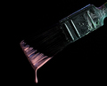
Dripby freakin_hilariousComment by Beautiful-Joe: I think a different colored background would have done better with the brush bristles being black and all, but a dark background just... Fits it. I don't know. Perhaps it was inevitible. It's a /very/ nice picture. Very nice. |
| Photographer found comment helpful. |
| 03/29/2007 06:55:16 PM |
|
| Photographer found comment helpful. |
| 03/29/2007 01:34:31 PM |
|
| Photographer found comment helpful. |
Home -
Challenges -
Community -
League -
Photos -
Cameras -
Lenses -
Learn -
Help -
Terms of Use -
Privacy -
Top ^
DPChallenge, and website content and design, Copyright © 2001-2026 Challenging Technologies, LLC.
All digital photo copyrights belong to the photographers and may not be used without permission.
Current Server Time: 06/21/2026 07:01:01 PM EDT.