| Image |
Comment |
| 12/05/2007 02:51:43 AM |
|
 Photographer found comment helpful. Photographer found comment helpful. |
| 12/05/2007 01:56:32 AM |
|
| Photographer found comment helpful. |
| 12/04/2007 08:11:25 PM |
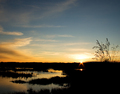
Into the Fireby freakin_hilariousComment by jdannels: I like the wisps of the brush sticking up. I may have tried work with the blues and cyan using a selective color adjustment layer to make it more of a complementary match. But as it is its a nice sunset. |
| Photographer found comment helpful. |
| 12/02/2007 07:43:05 PM |
|
| Photographer found comment helpful. |
| 12/02/2007 10:50:05 AM |
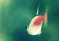
Swimby freakin_hilariousComment by Frankie_Lv: Hi Freak,
I Like the compostion of the image and the back ground color fits nicely here. However the image seems out of focus. The belly is blownout & I really don\'t get the feeling of \"stopped motion\". The glass is a bit dirty which is a bit of a distraction also. Having a 220 gal reef tank & taken a number of images try this in the future. Leaving the pump system on use your flash above the tank app 24 to 30 inches from the top of water & position yourself 30 to 36 inchs from the tank. The water along with it\'s movement seems to defuse the flash just right. Also the use of a black light works wonders really brings out the color variatons of the fish and it\'s surroundings. |
| Photographer found comment helpful. |
| 11/30/2007 08:52:49 AM |
Into the Fireby freakin_hilariousComment by spencerwood: The blue doesn't seem strong enough to match the intensity of the orange. Also the orange and blue fade into one another so you lose that high contrast element you get from strong adjacent complementary colours. Well composed thogh and the silhouette is well defined |
| Photographer found comment helpful. |
| 11/29/2007 11:48:00 PM |
|
| Photographer found comment helpful. |
| 11/29/2007 08:52:29 PM |
|
| Photographer found comment helpful. |
| 11/28/2007 01:18:25 AM |
|
| Photographer found comment helpful. |
| 11/27/2007 10:56:29 PM |
|
| Photographer found comment helpful. |
Home -
Challenges -
Community -
League -
Photos -
Cameras -
Lenses -
Learn -
Help -
Terms of Use -
Privacy -
Top ^
DPChallenge, and website content and design, Copyright © 2001-2026 Challenging Technologies, LLC.
All digital photo copyrights belong to the photographers and may not be used without permission.
Current Server Time: 06/22/2026 01:29:31 PM EDT.