| Image |
Comment |
| 07/05/2006 12:26:36 AM |
|
 Photographer found comment helpful. Photographer found comment helpful. |
| 07/04/2006 11:10:24 AM |
|
| Photographer found comment helpful. |
| 07/04/2006 08:35:12 AM |
|
| Photographer found comment helpful. |
| 07/03/2006 11:42:31 PM |
|
| Photographer found comment helpful. |
| 07/03/2006 03:52:01 PM |
|
| Photographer found comment helpful. |
| 07/03/2006 09:58:54 AM |
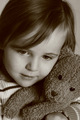
Cuddle Timeby -Bec-Comment by sacredspirit: Its always dangerous for me to enter photos of my kids, because I always tend to think the photo is better than it actually is. Of course I don't know if this is your baby or not, but at any rate the same rule must not apply for you, because this photo is stunning. Simply gorgeous, and you done a fantastic job at capturing it. I like it 100 %! |
| Photographer found comment helpful. |
| 07/02/2006 05:12:55 PM |
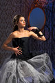
Emily2.jpgby -Bec-Comment by CalliopeKel: I think overall she just looks too posed, too un-relaxed. Sometimes music helps with this. Sometimes just talking to them prior to hitting the shutter. It's a great outfit and the girl is really pretty. Have you tried shooting her outdoors? |
| Photographer found comment helpful. |
| 07/02/2006 04:05:49 PM |
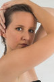
ME-4390.jpgby -Bec-Comment by yanko: I like the entry one also however this one also has lots of appeal. Now this is probably breaking rules but I would think about cropping this tighter on the left side so that *gasp* your hands are cut off. The thing I really like about the image is the smoothness of your arm as it frames your face and the hands, in particular the finger nails, breaks that flow and pulls my eyes over there, IMO. By the same token, I would crop a bit from the bottom to remove the edge of your dress that shows. Basically, what I want to see is just your facial features and your smooth skin framing all around it. Anyway, just a suggestion. I think you have a very nice shot. I wish my outtakes looked this good! |
| Photographer found comment helpful. |
| 07/02/2006 03:58:12 PM |
Emily2.jpgby -Bec-Comment by yanko: The color looks really good here and the lighting as well but maybe a bit too bright? Perhaps that's just because I saw your other version first, which I liked. Although the lighting here does fall on your model's face better producing less sharp edges. I also like how the model is looking towards the camera. However, the pose in general doesn't work as well for me as it did in the other version. I don't really know why that is. Maybe it has to do with this being a color version and it feels more upbeat and the stoic pose doesn't quite go with that? Ok, I think I'm rambling now. :P |
| Photographer found comment helpful. |
| 07/02/2006 03:46:31 PM |
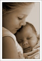
Sisters.jpgby -Bec-Comment by yanko: I agree with everything that has been said here.
To add, the composition is flawless. I love how the older sister fills the frame on the top, left and bottom leaving no gaps or anything to distract. The focal points are also perfect. The two faces are sorta in the rule of thirds areas but are closer in towards each other which works perfectly for the theme. The color and softness are also real winners here. And last but not least the connection the two have and also with the viewer is fantastic. Just goes to show you don't have to be looking directly into the camera to make it all work. Btw, those expressions are classic. The baby just looks so content and safe and the older one nurturing and caring. A heck of a photo Bec! |
| Photographer found comment helpful. |
Home -
Challenges -
Community -
League -
Photos -
Cameras -
Lenses -
Learn -
Help -
Terms of Use -
Privacy -
Top ^
DPChallenge, and website content and design, Copyright © 2001-2026 Challenging Technologies, LLC.
All digital photo copyrights belong to the photographers and may not be used without permission.
Current Server Time: 07/16/2026 06:15:33 PM EDT.