IMG_2402ecrop.jpgby
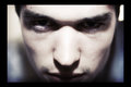
BenComment by Sting11165: (from forum)
Damn, I was going to try to do some work, then I saw this one. I'll do this one then I'll do an hour of work :)
This image is striking to say the least. If you were trying to make the viewer feel that an unhappy guy is invading his/her space, you did it well. I'm assuming this is a self-portrait, at least from what I saw on your profile. You could scare young children with that look.
This is one of those images where the thumbnail is almost better than the full-size version. It just feels like some of the technicals aren't quite there. To pull this off, you need an angry look (check), harsh (hard) lighting (check), selective focus (check -- is that the filter on the image's page?), and some sharply in focus eyes (almost check). I really, really want to see the eyes in super detail (and the appropriate part of the face/nose as well, which is close). That would give the feeling of someone getting so close you can't focus on anything but his eyes, and he is close enough you can see the pores on his nose. The right eye, in particular, seems soft, but the left does too.
If this is a self-portrait, than yeah, that focus is hard to get because you can't line it up. If you are taking a photo of someone else, switch to a single focus point, focus on their lower eye, reframe, and shoot. Alternatively, that might be due to a shutter speed that was slightly too long and the model moved.
Other things that could improve the image: I feel the face is a bit overexposed and the eyes are too dark. The overexposure works well, actually, and I think you should keep it. If you took it again try to get a smaller tonal range by increasing the fill light around the eyes (maybe a piece of paper reflecting from under the camera?) and expose everything a little less. The paper/reflector also might put a nasty little glint in the eye too. Then apply the overexposure to the face in post-processing using curves if desired. It'd just give you a little more flexibility in processing if you don't blow the highlights out.
If the out of focus regions are from a soft-filter, keep it -- it is working really well. Just preserve the eye focus because that's where your viewer will be looking.
Other comments -- the background is appropriate -- I actually like it darker on the right and lighter on the left. Are you holding the camera with your left arm? The border bugs me because it is uneven... silly, I know, but it'd be nice if it was the same size all around.
Summary: so, yeah, I said a lot, but lets be honest -- the picture is really close to perfect as it is. Very unsettling.
Message edited by author 2007-04-29 14:26:05.