| Image |
Comment |
| 05/02/2007 08:57:32 PM |
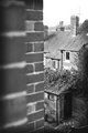
Shedby BenComment by colorcarnival: This is fun - what a great composition and perspective. I would have tried to do this without the wall - and I don;t think it would have been as interesting as this one. I love the contrast and details of the pic. Very cool! |
 Photographer found comment helpful. Photographer found comment helpful. |
| 05/02/2007 08:45:37 PM |
Shedby BenComment by mia67: This is such interesting and cool picture. Great angel here and play with right shadow, like it a lot. |
| Photographer found comment helpful. |
| 05/02/2007 08:39:36 PM |
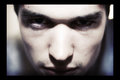
1.jpgby BenComment by sherpet: In your face type of portrait, that works for me..... |
| Photographer found comment helpful. |
| 05/02/2007 08:09:32 PM |
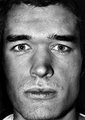
IMG_2402ecrop.jpgby BenComment by pineapple: Like a photo taken by those secret cameras inside bank ATM machines. It looks more like an invasion of privacy than some sort of self-portrait. |
| Photographer found comment helpful. |
| 05/02/2007 07:45:50 PM |
1.jpgby BenComment by violinist123: Lots of interesting texture throughout the shot and well focused. It's a mugshot so there's not a lot to comment on, but for what it is I like it. Maybe the shinier spots could have been avoided, but I always run into that when doing self portraits so I'm not one to talk. It's generally why I go low key with the lighting (masks my inability nicely). Good work. |
| Photographer found comment helpful. |
| 05/02/2007 12:34:57 PM |
Shedby BenComment by CapeSail: Nice shot, makes you want to lean out around the corner for a better view. Good perspective. |
| Photographer found comment helpful. |
| 05/02/2007 11:44:52 AM |
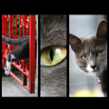
Portrait of a Catby BenComment by levyj413: Terrific concept and execution! Love the colors, love the variety of subjects. And you put them together nicely, too. |
| Photographer found comment helpful. |
| 05/02/2007 09:00:28 AM |
Portrait of a Catby BenComment by EstimatedEyes: The picture on the right is great. The middle picture is a nice detail shot, but could have been smaller and cropped at the top and bottom. The one on the left doesn't do a lot for me. Perhaps a different layout and swapping out the left pic would have improved this. |
| Photographer found comment helpful. |
| 05/02/2007 08:50:29 AM |
Shedby BenComment by jonfrommk: I like the composition. Was wondering about the fact that there are two walls on the left hand side but for some reason it works. Suffers a bit in terms of the whites being blown out especially the window frame of the house and the sky around the aerial
|
| Photographer found comment helpful. |
| 05/01/2007 08:18:02 PM |
Shedby BenComment by sherpet: Unusual composition, and I like it, as it makes the houses on the right stand out so much more, beside the close brick wall..... |
| Photographer found comment helpful. |
Home -
Challenges -
Community -
League -
Photos -
Cameras -
Lenses -
Learn -
Help -
Terms of Use -
Privacy -
Top ^
DPChallenge, and website content and design, Copyright © 2001-2026 Challenging Technologies, LLC.
All digital photo copyrights belong to the photographers and may not be used without permission.
Current Server Time: 07/16/2026 11:16:58 PM EDT.