DPChallenge: A Digital Photography Contest You are not logged in. (log in or register
 
Browse Settings
Currently viewing:
Registered Useryourbuddyjhawk

Show comments:

Per page:

Order:

Comments:


Comments Received by yourbuddyjhawk
Pages:   ... ...
Showing 61 - 70 of ~134
Image Comment
1000 mg= wow
04/26/2006 05:54:20 PM
1000 mg= wow
by yourbuddyjhawk

Comment by pacpinto:
Overall, this picture is a bit messy. I can't seem to find the subject... Also, the yellow flower is a bit out of focus. Sorry, not a very good one.
1000 mg= wow
04/26/2006 07:36:28 AM
1000 mg= wow
by yourbuddyjhawk

Comment by hotpasta:
it's quite a messy shot that doesn't really meet the challenge...sorry
>:-(
04/24/2006 10:28:11 PM
>:-(
by yourbuddyjhawk

Comment by deepfrog17:
colors look a little off.
>:-(
04/24/2006 01:30:56 PM
>:-(
by yourbuddyjhawk

Comment by melismatica:
This is a bit too busy for me. The image quality isn't very good either. The image lacks sharpness. I think shooting this at a different time of day when the lighting is less harsh and contrasty would have helped your exposure. It is possible to get a good image in contrasty sunlight but it involves bracketing your exposures. This kind of lighting fools most light meters and you have to perform some manual functions to compensate for that. I use a point-and-shoot and what I do is adjust the EV setting which automaticallly brackets exposure for you. I would have concentrated on the area at the top of the pump to bring out detail in the lettering and included more of the faucet. The chain and lock don't add any visual interest and the window grill in the background adds a lot of distracting pattern. Really, this was a poor angle of view for this shot.
>:-(
04/20/2006 09:30:36 AM
>:-(
by yourbuddyjhawk

Comment by kiwiness:
I saw this title before somehow in a different sequence :)
>:-(
04/19/2006 12:14:46 PM
>:-(
by yourbuddyjhawk

Comment by scotthadl:
The subject is croped in odd places.
My Baby
04/17/2006 12:58:38 PM
My Baby
by yourbuddyjhawk

Comment by Nald:
You captured some good mechanical components here but this feels very much a snapshot. The blown out highlights on the distributor and headers distract my attention too much. Plus there is no real focal point to this shot, where should my attention be draw to? I do like the bluing of the headers, some different angles / lighting and you'll have some good stuff I think.
My Baby
04/14/2006 02:47:46 AM
My Baby
by yourbuddyjhawk

Comment by jccminty:
no chrome.
WEEEEEEEEEEEEEEEEEEEEEEE!
04/11/2006 04:34:45 PM
WEEEEEEEEEEEEEEEEEEEEEEE!
by yourbuddyjhawk

Comment by klstover:
Greetings from the Critique Club!

First, let me say that I am not a professional or even a very good amature photographer, so you may want to take my comments with a grain of salt.

Meeting the Challenge: Definitely.

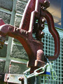
Composition / Title: I love the composition. Aside from the telephone pole, which you can't clone out in basic (and is sort of nit-picky anyway) I think the composition is awesome. I like that the frog forms a sideways oval and the person forms another sort of oval, and I like the angle between them. Hope that makes sense!

I do agree with the earlier commenters that showing the face would definitely have added a lot. It would have added to the shot on its own, by showing the playful emotion, but it would also have fit with the title better. Hypothetically, if you had to choose to change the title or the face, I'd add the face, but if it weren't possible for you to reshoot or whatever, I'd tone down the title a little bit. I love the title because it is so much fun! But maybe making it not all capital letters would have made it fit with the image a bit better.

Lighting / Color: I wish the sky were more blue, but that can't be helped I think. Also, it being white does help to set off the mountains in the distance, and they are pretty cool. I think the shadow underneath definitely should be there as it goes with the outdoor look but maybe shooting at a different time of day would make the shadow a bit less noticable? I am not sure. I like the highlights on the frog - they add depth but are not overpowering.

Camera Work / Post Processing: Not sure what is what because of no photographer's comments.

Image Dimensions and Filesize: At least one side should be 640px to maximize size and impact but not a huge deal here.

Misc / My subjective thoughts: I didn't enter this challenge, but this - someone who doesn't look like a child, riding one of those toys at the park - was what I would have gone for if I had. So I definitely like your photo. :-) I wonder if it is just me who thinks the frog looks angry? Maybe not angry, but determined. In any case, it adds an extra interest for me. Also, great shoes.

I hope this helps! Feel free to PM me if you have any questions.

Message edited by HBunch - Fixed CC glitch.
untitled
04/10/2006 10:30:09 AM
untitled
by yourbuddyjhawk

Comment by kitts:
the vibrant colors are very eye catching. i would like to see all three birds in focus and perhaps a different color backgroun to pop out the birds. (10)
Pages:   ... ...
Showing 61 - 70 of ~134


Home - Challenges - Community - League - Photos - Cameras - Lenses - Learn - Help - Terms of Use - Privacy - Top ^
DPChallenge, and website content and design, Copyright © 2001-2025 Challenging Technologies, LLC.
All digital photo copyrights belong to the photographers and may not be used without permission.
Current Server Time: 06/15/2025 07:04:17 PM EDT.