| Image |
Comment |
| 03/01/2006 10:08:41 PM |
|
 Photographer found comment helpful. Photographer found comment helpful. |
| 03/01/2006 03:36:26 PM |
|
| Photographer found comment helpful. |
| 03/01/2006 02:14:51 PM |
|
| 02/28/2006 09:03:32 AM |
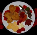
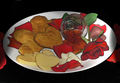
Breakfast from the heart.jpgby dolphnz8Comment by idnic: Aweeee Cindy - This one is sooooooo much nicer. The lighting is clean and crisp, all of the colors look right, even the textures are captured perfectly. I didn't know those were butter pats in the previous version, but I can see it clearly now. I'm sorry about your picture mix-up. I use DPC at the end of the shot I plan to submit to avoid confusion - maybe you could try that or something similar. This shot would definitely have scored higher than the one you submitted. I would have given it a 6 easy.
Hope that helps and good luck with your future challenges.
Cindi |
| Photographer found comment helpful. |
| 02/27/2006 11:56:05 PM |
Breakfast from the HEARTby dolphnz8Comment by dolphnz8: Originally posted by idnic:
Greetings from the Critique Club
I'll begin with my first impression, which was "aweee sweet". Then I began looking at the details -- The shadows on the left and right sides catch my eye first, very distracting. Next the reds, they are very oversaturated to the point that they aren't quite red anymore and lastly the overall issue that probably hurt this image's score more than anything - there are halos around all of the rose petals and some of the cookies - overprocessed, but I can't quite put my finger on why - its not oversharpening - unless blur was used after - just looks odd.
I like the composition - with a tighter crop (cropping out the shadows on the sides) and reprocessing I'm sure this will be quite nice.
I hope I have been helpful.
Cindi |

Attached you will find the photo that I MEANT to upload @ 11:58!!!!
The copy I submitted was one that I was playing around with in the effects department! i.e. lighting, shadows, colored pencil, charcoal, mosaic and what not. Just got Photoshop 4.0 and was experimenting. When I realized what I had done, the site was already closed to enter the correct one. Just having lost all the fingers on my left hand a coulple years ago, the cutting of the cheese and butter hearts was very tedious for me, and I put a lot of work into it!!! Only been digital imaging for a couple of months now, and so greatlt appreciate the help and guidance I rec'v from all in the forum threads. If you have time, i would greatly appreciate your input on the REAL one, and I graciously thank you in advance.
Sincerely,
"Tired-Blonde-at-the-Beach" :O)
Cindy L. |
| 02/27/2006 10:33:22 PM |
Breakfast from the HEARTby dolphnz8Comment by idnic: Greetings from the Critique Club
I'll begin with my first impression, which was "aweee sweet". Then I began looking at the details -- The shadows on the left and right sides catch my eye first, very distracting. Next the reds, they are very oversaturated to the point that they aren't quite red anymore and lastly the overall issue that probably hurt this image's score more than anything - there are halos around all of the rose petals and some of the cookies - overprocessed, but I can't quite put my finger on why - its not oversharpening - unless blur was used after - just looks odd.
I like the composition - with a tighter crop (cropping out the shadows on the sides) and reprocessing I'm sure this will be quite nice.
I hope I have been helpful.
Cindi |
| Photographer found comment helpful. |
| 02/27/2006 09:30:29 PM |
|
| Photographer found comment helpful. |
| 02/27/2006 04:13:37 PM |
|
| Photographer found comment helpful. |
| 02/27/2006 01:56:16 PM |
|
| Photographer found comment helpful. |
| 02/26/2006 08:24:47 PM |
|
| Photographer found comment helpful. |
Home -
Challenges -
Community -
League -
Photos -
Cameras -
Lenses -
Learn -
Help -
Terms of Use -
Privacy -
Top ^
DPChallenge, and website content and design, Copyright © 2001-2026 Challenging Technologies, LLC.
All digital photo copyrights belong to the photographers and may not be used without permission.
Current Server Time: 07/16/2026 12:05:31 AM EDT.