In the heat of anger.by
TNCameronComment by hanneke: Hello, Greetings from the Critique Club. As requested, here is an indepth critique of your submission.
Please keep in mind this is a personal opinion. This is also my very first critique for the CC ;)
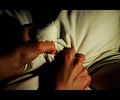
My first impression was a good one. Great visible textures.
The composition looks pretty good, though my eyes keep going to the lighter right part of the image. The sheet seems to look a bit too straight, a couple of wrinkles might have fitted better.
The subject is recognisable, and clear. Everybody has been angry once in a while ;)
Focus is spot on, and in a way you can see the textures of the hands and the sheet. That looks great! I'm not quite sure about the colors, the hands look a bit too red. Have you tried B&W with this image? Or maybe a B&W-layer, with an opacity of, let's say, 75%. But it all comes down to taste, and I think this is what you were looking for. The light might be a little brighter at the left side of the image.
The border seems to fit in this kind of image, but it's not my personal taste.
I like the fact you've tried something different then the "usual" heat. This is a unique idea for the challenge, and I think you did a great job overall.
I hope you've found this critique helpful. Good luck with future challenges!