| Image |
Comment |
| 06/11/2003 05:50:26 AM |
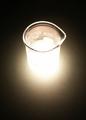
New Scientistby PaulkComment by Musicman: I wish the beaker was on the lower half of the cover page. Leaving it up high leaves a lot of dead space on the bottom. |
 Photographer found comment helpful. Photographer found comment helpful. |
| 06/11/2003 03:31:16 AM |
|
| Photographer found comment helpful. |
| 06/11/2003 02:02:35 AM |
New Scientistby PaulkComment by shadow: too much contrast on the bottom of the subject. contrast too high, details lost making the photo not very catchy. However, as a magazine cover, this is good. |
| Photographer found comment helpful. |
| 06/11/2003 01:28:22 AM |
|
| Photographer found comment helpful. |
| 06/01/2003 06:38:07 PM |
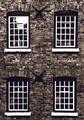
Gregg Mill Windowsby PaulkComment by wetland: Would loved to have seen this without the bright reflection in the upper left window. I think it distracts from the overall effect. Great idea though. thanks |
| Photographer found comment helpful. |
| 05/31/2003 09:35:37 PM |
Gregg Mill Windowsby PaulkComment by BJ: I really like the composition and concept of this shot. I think however it would be better without the reflection in the upper left window as I find it very distracting. Maybe if taken at a different time of day? -just my thought:) |
| Photographer found comment helpful. |
| 05/27/2003 08:26:55 PM |
Gregg Mill Windowsby PaulkComment by David Ey: not too exciting...but it is a nice chrisp photo and well framed (positioned)
maybe a diferent angle would have helped
|
| Photographer found comment helpful. |
| 05/27/2003 12:13:37 PM |
|
| Photographer found comment helpful. |
| 05/27/2003 08:11:19 AM |
Gregg Mill Windowsby PaulkComment by qachyk: Strange. The photo isn't crooked, but the building parts are. Must be an old building. Looks good with the tone chosen. |
| Photographer found comment helpful. |
| 05/27/2003 12:55:28 AM |
Gregg Mill Windowsby PaulkComment by dacrazyrn: Great subject with the contrasting b&W's. The brick areas appear a touch dark...like to see it brought out more to give more texture. the top left window has that blown out area that is a bit distracting |
| Photographer found comment helpful. |
Home -
Challenges -
Community -
League -
Photos -
Cameras -
Lenses -
Learn -
Help -
Terms of Use -
Privacy -
Top ^
DPChallenge, and website content and design, Copyright © 2001-2026 Challenging Technologies, LLC.
All digital photo copyrights belong to the photographers and may not be used without permission.
Current Server Time: 07/16/2026 11:11:17 PM EDT.