| Image |
Comment |
| 01/30/2004 01:53:04 AM |
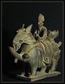
The Horseby Harz_JoergComment by leaf: critique club comment ....
I think you have a quite strong image, with the dark deep background and engergy filled subject. I think you chose a good background color. The cropping on this image is VERY tight, and much too tight actually on the bottom and perhaps on the right. The bottom white line is 1 pixel away from the bottom of the statue... which creates an akward line, and problem in the photo. It stops the eye at an unattractive, or uninteresting spot, it also leads the eye to the edge of the photo and leaves it there stranded. As you said, there is some white blasting in the image, and I agree. The could be softenend with a softer light sorce, or less direct light. Perhaps if you bounced the light off the wall before letting it hit the statue. i think the horiztonal (left right) angle is fine, and reasonably interesting, but perhaps you could play with the verticle. Try taking the picture from a lower or higher vantage point.
hope this helped. |
 Photographer found comment helpful. Photographer found comment helpful. |
| 01/29/2004 11:09:24 PM |
|
| Photographer found comment helpful. |
| 01/29/2004 01:36:36 PM |
|
| Photographer found comment helpful. |
| 01/28/2004 06:19:33 AM |
|
| Photographer found comment helpful. |
| 01/27/2004 11:19:40 PM |
The Horseby Harz_JoergComment by casualguy: Very nice exposure and lighting, great job! - This would have fit well in the NG challenge also....quite a archaic look to it. |
| Photographer found comment helpful. |
| 01/27/2004 04:42:38 PM |
|
| Photographer found comment helpful. |
| 01/26/2004 10:24:17 PM |
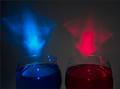
Spiritsby Harz_JoergComment by nephrotic: One of the few in this category that has (I think) used one of the traditional definitions of "painting with light". Beautiful colours. It is only the tilt of the blue glass that does not seem quite right. I like the highlights - particularly the one catchlight at the top rim of the blue glass. |
| Photographer found comment helpful. |
| 01/26/2004 11:04:26 AM |
|
| Photographer found comment helpful. |
| 01/26/2004 09:07:09 AM |
The Horseby Harz_JoergComment by nephrotic: I do like this. I had to photograph something like this many years ago.for an auctioneer. One point. As the background is black I would have just put the smallest (and I do mean smallest) amount of light to the left, rear. That would just give the very slightest amount of shape to parts which merge into the background and give just the smallest amount of detail into the figure. |
| Photographer found comment helpful. |
| 01/26/2004 08:08:50 AM |
Romanic Architecture of the 11th Centuryby Harz_JoergComment by geschlechtmann27: Great example of architecture! Overall this photo is great. The repetition of column textures. The texture of the snow! Overall texture.
The lighting of this photo is a little dull. Your perspective is great. The slant of the photo gives the eye somewhere to move. Movement is great in a still life photo! If I were the editor of National Geographic your picture would definately go in this issue! Great Job.
geschlechtmann27
Critique Club |
| Photographer found comment helpful. |
Home -
Challenges -
Community -
League -
Photos -
Cameras -
Lenses -
Learn -
Help -
Terms of Use -
Privacy -
Top ^
DPChallenge, and website content and design, Copyright © 2001-2026 Challenging Technologies, LLC.
All digital photo copyrights belong to the photographers and may not be used without permission.
Current Server Time: 07/16/2026 01:31:22 AM EDT.