| Image |
Comment |
| 09/17/2007 07:21:15 AM |
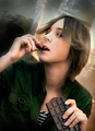
chocoholicby ursulaComment by annig: nice image, though I didn't get the wrapper part either. Does look like she's really into the chocolate! :) |
 Photographer found comment helpful. Photographer found comment helpful. |
| 09/17/2007 06:35:28 AM |
|
| Photographer found comment helpful. |
| 09/17/2007 06:21:41 AM |
chocoholicby ursulaComment by whiteroom: well done ursula! i thought she was on a cell phone from the thumb :)
i must say i didnt get the wrapper part, duh.
|
| Photographer found comment helpful. |
| 09/16/2007 11:11:40 PM |
chocoholicby ursulaComment by citymars: Beautiful! Good work from the model, too. Chocolate ecstasy. Soft and dreamy, good color palette. The wrinkled backdrop detracts slightly, but a high score from me. |
| Photographer found comment helpful. |
| 09/16/2007 02:25:00 AM |
chocoholicby ursulaComment by klstover: At first I thought this was overdone, and the background distracted me. Then I realized that the background reminded me of being IN a chocolate bar wrapper, which is awesome! And the expression.. maybe it is a tad overdone, but I think the model pulls it off very well. 10! |
| Photographer found comment helpful. |
| 09/15/2007 10:40:45 AM |
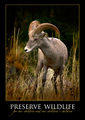
PRESERVE WILDLIFEby ursulaComment by violinist123: Critique Club feedback -
This entry followed the 'classic' motivational poster formula in terms of graphical design and content layout.
Very nice picture (the bit of dodge/burn to highlight the center of the shot is subtle and well done), the message in a large font and centered for impact, the font itself one that has a feeling of authority.
Two things that struck me as slightly off. First, it's more of a public service announcement than a motivational poster. Could argue it either way, but Smokey the Bear telling me not to toss cigarettes into piles of leaves doesn't make me feel motivated, just informed. I think a lot of people that voted in the challenge did have a fairly concrete definition of what type of message should be presented.
Second thing was the cursive script. I think it's pretty, I like how you placed it and the choice of color was extremely complementary to the rest of the poster - but I can barely read it. It just doesn't work well for the medium (medium being postage stamp sized web images) though is no doubt stunning at a decent size.
This image scored quite well and rightfully so. I think those couple of nitpicks probably kept it out of top 10, because really it's a solid entry.
Great work! |
| Photographer found comment helpful. |
| 09/15/2007 12:26:24 AM |
|
| Photographer found comment helpful. |
| 09/14/2007 07:03:29 PM |
|
| Photographer found comment helpful. |
| 09/14/2007 01:40:01 PM |
|
| Photographer found comment helpful. |
| 09/12/2007 06:17:41 PM |
|
| Photographer found comment helpful. |
Home -
Challenges -
Community -
League -
Photos -
Cameras -
Lenses -
Learn -
Help -
Terms of Use -
Privacy -
Top ^
DPChallenge, and website content and design, Copyright © 2001-2026 Challenging Technologies, LLC.
All digital photo copyrights belong to the photographers and may not be used without permission.
Current Server Time: 05/05/2026 05:18:15 PM EDT.