Keeper of the Flameby
crazedfost78Comment by Artyste: Hello, and greetings from the Critique Club. What follows is my best attempt to Critique this photo from a DPC voter's point of view. I'll do my best, but please excuse any comments that may be unintentionally rude or insulting.
Initial Thoughts
Dang.. nice body, and I love the look here
Composition/Content
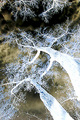
I'm a little wary about the amount at the top here. Not sure that it's something voters liked, but can't really know. No comments to that regard anyway, but it seems just a little "off" to me. Your model is great, and it's a very emotive pose.
Background
Great coloring, really plays off with the model
Camera Work/Technical
Everything seems pretty good here for the feel of the photo, but without that sharpness that voters expect, you lose a few points there. It's unfortunate, but sometimes we have to take that hit to be brave with our vision.
Digital Processing
The Grain. Oh, the grain. The voters, obviously, really hit you hard because of this. On DPC.. grain is, usually, death. I know that you probably knew this and went against the grain (pun intended), and this isn't a knock on you.. but for DPC submissions, if you care about scoring, avoid it! For me, it's what *makes* the photo. It's perfect, and the darkness and mood are really cemented by it.
Fits the Challenge
No problems here. Fits to a tee.
My Opinion of the Photo
Possibly one of the better color portraits I've seen that isn't the "DPC Flavor of the Month". Congratulations on being brave enough to submit something different. I love it, and although I'm a little off on the amount of upper negative space.. it's a job well done.