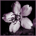
Apple blossomby
2mccsComment by e301: from the
Critique Club
Comments are so difficult to know how to handle - the variety you recieved for this are almost completely contradictory. Some like the tone, some apparently hate it, some like the hardness of light, some dislike it. The only trick is, I think, to look at the work of those who leave comments and see what you think of their own stuff.
There's a lot of good things here, I think. You've understood the square crop very well - the format throws a lot of the supposed 'rules' out of the window, and makes the centre of frame far stronger than in a landscape or portrait shot; and it's well suited to a rigidly graphical subject, such as this flower from this angle. Your toning works well also - it allows some feeling of warmth without resorting to the over-sed expedient of sepia, and is effective for the shadows that make the texture so evident in the petals.
The comment about the hardness of the light has a point, to my eye: though I don't think I would have tried to soften the direct light (that's useful for definition, and as I've said, for bringing out the papery texture of the petals. What I would have tried (and no guarantee of success) would be to put a reflector of some sort to image left. That need only be a piece of white paper held up just out of frame, but that would bounce a soft-edged light back into the image from the opposite side, and that would make the shadows less absolutely black, leaving some detail there. The edges would still be hard, and so the texture would still show, and you might gain some more definition around the left-hand side of the flower.
A good shot though, for all its score - unless they're quite outstanding, flowers often get knocked quite hard in the voting.