outsourceby
posthumousComment by Paul: Greeting for the Critique Club:
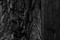
Typical! First few goes at this Critique Club thing and I get one of yours! Baptism of fire (fitting then, that the wood appears charred!)
OK - time to 'fess up, I gave this a 3 in voting (I've said it now): hopefully the things I didn't like about it are the things that appeal to you.
I'll start off with what I did like - the deep blacks, they have an unusual richness about them, almost luxurious and indulgent, I quite like the white flecks of the wood too and how they suggest a constellation.
So, why the low score... It is of course a very two dimensional piece, completely minimalist in the Z axis, I feel the image acts like a bit of a wall, keeping the viewer out rather than inviting us in to explore. I wonder if the dark, dark tones compound this effect - this image feels like a no go area (no viewers allowed - move on). In voting, that's what I did - I hit you with a bit of a drive-by vote. No such copping out here though.... Being 'forced' to write a long comment is allowing me sufficient time to engage with it and I do declare, its a bit of a grower. If I think back to the challenge brief - all that stuff about light and shade and texture and form - well you've nailed all that.
One thing I do note as I look at it is that I think I would prefer it rotated 90 degrees clockwise. Years ago I had a previous life in geology and with the rotation your image offer nostalgic suggestions of rock strata - the juxtaposition of materials, tree, wood and (suggestion of) rock appeals to me.
Paul