| Image |
Comment |
| 08/29/2006 11:24:12 AM |
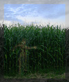
into the cornfieldby posthumousComment by LalliSig: Sorry, I normally try to ignore frames but this one is utterly horrible, mainly in the sense that it does nothing but pull my eye toward the edges of the photo and I can´t really appreciate what looks like a good photo. I did try though and I really like this shot, I really dig the shape or outlines of a person there, really cool and I still voted this shot a 8 despite the frame, who knows what I would have given it had you not used it. |
 Photographer found comment helpful. Photographer found comment helpful. |
| 08/29/2006 09:46:04 AM |
into the cornfieldby posthumousComment by Artifacts: A very different interpretation of the challenge topic. This is a good metaphoric representation of someone wandering lost and bonded closely to nature in order to get through it and find their way back. Like the use of the rule of thirds for representing "The Lost Photographer" but unsure how well the border fits the image.
I wished to have corn to eat out where I was lost. That would have been tastier than the sprouts and cactus fruit I ate. It is interesting to note that in this area (Phoenix, Arizona USA), where irrigated, corn is grown in abundance and looks just like this. Next time I think I'll choose to get lost there. :) - Steve |
| Photographer found comment helpful. |
| 08/28/2006 08:22:28 PM |
|
| 08/28/2006 05:35:27 PM |
|
| Photographer found comment helpful. |
| 08/28/2006 08:19:02 AM |
into the cornfieldby posthumousComment by zarniwoop: Like the picture, hate the framing. it takes so much away from the figure, and rather than drawing my attention to the picture it draws my attention to the sat/desat border. In this case, anyway. |
| Photographer found comment helpful. |
| 08/28/2006 02:38:53 AM |
|
| Photographer found comment helpful. |
| 08/28/2006 12:58:20 AM |
|
| Photographer found comment helpful. |
| 08/27/2006 03:42:38 PM |
|
| Photographer found comment helpful. |
| 08/27/2006 12:57:39 PM |
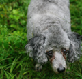
poodlesoftby posthumousComment by kwani: Love the look of the eyes. I personally would love to see the dog walking on a 'less distracting' ground |
| Photographer found comment helpful. |
| 08/27/2006 05:39:52 AM |
|
| Photographer found comment helpful. |
Home -
Challenges -
Community -
League -
Photos -
Cameras -
Lenses -
Learn -
Help -
Terms of Use -
Privacy -
Top ^
DPChallenge, and website content and design, Copyright © 2001-2026 Challenging Technologies, LLC.
All digital photo copyrights belong to the photographers and may not be used without permission.
Current Server Time: 06/21/2026 11:59:01 AM EDT.