| Image |
Comment |
| 12/13/2006 02:54:05 PM |
|
 Photographer found comment helpful. Photographer found comment helpful. |
| 12/13/2006 02:27:48 PM |
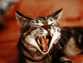
a violent youthby posthumousComment by J-Me: Wow, I've seen my cats like that too! *grin* This really captures this furbaby's emotions! I know this is an action shot and therefore, hard to focus properly, but, since it is out of focus, perhaps, having cropped it down to just the face??? Might have put more focus on the cat's emotions and taken away from the blur??? |
| Photographer found comment helpful. |
| 12/13/2006 11:33:49 AM |
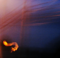
The Strange Musical Life of the Honey Moonby posthumousComment by JuliBoc: Oh my gosh. I almost spoiled you brown ribbon. I gave this a 9. I really like the colors and the way the dark area on the bottom mirrors the power lines. I had no idea what that bright worm was, but the bright spot of color was key to the composition. This must have been really fun for you reading all the comments. Congratulations on meeting your goal. |
| Photographer found comment helpful. |
| 12/13/2006 08:50:48 AM |
The Strange Musical Life of the Honey Moonby posthumousComment by posthumous: Originally posted by agenkin:
This is musical. You placed the light squiggle into the lower left corner, but the squiggle attracts a lot of attention. I wish you found another spot in the frame for such accent. 7 |
I agree, but this shot was an accident. As it is, you just have to accept that it is an extremely low note. :) |
| 12/13/2006 08:49:01 AM |
The Strange Musical Life of the Honey Moonby posthumousComment by posthumous: Originally posted by rinac:
I'm lucky enough to have a brother-in-law who is completely "off the wall" with his photographic style. He sees amazing things where others see nothing but grain and blur, and he has taught me to look for some of those amazing things too :) In a round-about sort of way, your image reminded me of one of his: music is wrought from base elements with bare hands |
You flatter me with the comparison. His image is an excellent evocation of music, head and shoulders above the hordes of guitar players you will find in the DPC portfolios. |
| 12/13/2006 04:24:05 AM |
|
| Photographer found comment helpful. |
| 12/13/2006 02:46:27 AM |
|
| Photographer found comment helpful. |
| 12/13/2006 02:15:49 AM |
|
| Photographer found comment helpful. |
| 12/13/2006 12:35:35 AM |
The Strange Musical Life of the Honey Moonby posthumousComment by levyj413: Interesting piece of art there, Don. Well, first let me congratulate you on knocking off your goal of getting the brown without trying. :)
As to the image, I do like it as an abstract. I find that the large grain makes it look almost like a pointillist painting, and I've always liked those.
As to how it relates to the concept of life, I have to admit I'm scratching my head. |
| Photographer found comment helpful. |
| 12/13/2006 12:33:59 AM |
|
| Photographer found comment helpful. |
Home -
Challenges -
Community -
League -
Photos -
Cameras -
Lenses -
Learn -
Help -
Terms of Use -
Privacy -
Top ^
DPChallenge, and website content and design, Copyright © 2001-2026 Challenging Technologies, LLC.
All digital photo copyrights belong to the photographers and may not be used without permission.
Current Server Time: 06/23/2026 08:49:56 AM EDT.