| Image |
Comment |
| 06/08/2007 01:36:46 AM |
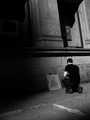
Art Schoolby posthumousComment by yanko: The shadows makes it look like the artist's real world is incomplete just like that of the artwork. |
 Photographer found comment helpful. Photographer found comment helpful. |
| 06/08/2007 12:22:33 AM |
Art Schoolby posthumousComment by Melethia: I think Nick and Sevil are good influences on you. :-) From out of the darkness... Can't find anything I don't like about this - the shadows, the lines, the angles, the textures. Very nice work indeed. |
| Photographer found comment helpful. |
| 06/07/2007 10:15:05 PM |
|
| Photographer found comment helpful. |
| 06/07/2007 09:51:29 PM |
|
| Photographer found comment helpful. |
| 06/07/2007 07:39:42 PM |
Art Schoolby posthumousComment by violinist123: This type of photo resonates well with me. Unfortunately this crop really holds the shot back. The big blob of black doesn't add to the image, and really pulls the eye away from the subject. The subject and the detail behind it make this image, I would love to see the crop display them more prominently. |
| Photographer found comment helpful. |
| 06/07/2007 07:12:55 PM |
|
| Photographer found comment helpful. |
| 06/07/2007 07:11:50 PM |
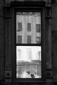
Windowby posthumousComment by simplesilent: oh my god.
do you know how long it took me to see that cat.
i didnt get it for the longest time.
weird. |
| Photographer found comment helpful. |
| 06/07/2007 05:25:32 PM |
Art Schoolby posthumousComment by skewsme: this really is quite striking when you come across it. the darkness leads you to the subject. nice elbows. |
| Photographer found comment helpful. |
| 06/07/2007 09:39:47 AM |
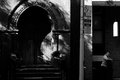
Church and Stateby posthumousComment by Germaine: Interesting composition. You've got a natural diptych separated by the light pole. That guy on the right doesn't seem too sure about you... 8)
Minor nit, I might try cropping out that narrow strip of light at the very top on the right hand side. To me, it's a bit distracting and by getting rid of it, I think you would emphasize the vertical composition of the shot.
Nice work. |
| Photographer found comment helpful. |
| 06/07/2007 02:29:05 AM |
|
| Photographer found comment helpful. |
Home -
Challenges -
Community -
League -
Photos -
Cameras -
Lenses -
Learn -
Help -
Terms of Use -
Privacy -
Top ^
DPChallenge, and website content and design, Copyright © 2001-2026 Challenging Technologies, LLC.
All digital photo copyrights belong to the photographers and may not be used without permission.
Current Server Time: 07/18/2026 05:58:03 AM EDT.