| Image |
Comment |
| 10/08/2007 09:53:59 AM |
|
 Photographer found comment helpful. Photographer found comment helpful. |
| 10/08/2007 05:39:13 AM |
|
| Photographer found comment helpful. |
| 10/06/2007 08:13:03 PM |
|
| Photographer found comment helpful. |
| 10/06/2007 01:19:41 PM |
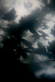
a question about fallingby posthumousComment by sevilduvarci: this is so beautiful. i agree with erin and yanko, this has a very serene dream-like look, yet makes you feel claustrophobic at the same time. i love this contrast. briliant capture to achieve this balance. |
| Photographer found comment helpful. |
| 10/06/2007 01:31:53 AM |
|
| Photographer found comment helpful. |
| 10/04/2007 10:34:45 PM |
|
| Photographer found comment helpful. |
| 10/04/2007 10:34:16 PM |
a question about fallingby posthumousComment by colorcarnival: I saw this during the challenge and my first thought was that it looked like someone was photographing this underwater, looking up. And everything was kind of swirling down. The soft light creates a beautiful dreamy feeling. |
| Photographer found comment helpful. |
| 10/04/2007 09:20:48 PM |
a question about fallingby posthumousComment by krnodil: I gave this an 8, it had a lot of appeal for me - you somehow managed to get that ethereal glow, which in other images is often used to make a shot "pretty", and coupled it with encroaching shadows and a whiff of menace. Soft focus, and yet it teeters on the edge of nightmare - genius! |
| Photographer found comment helpful. |
| 10/04/2007 08:14:26 PM |
Beaconingby posthumousComment by NikonJeb: A little weak on the title/subject tie-in for me, but the exposure, lighting, detail, and conversion are all nicely done. |
| Photographer found comment helpful. |
| 10/04/2007 02:41:29 PM |
|
| Photographer found comment helpful. |
Home -
Challenges -
Community -
League -
Photos -
Cameras -
Lenses -
Learn -
Help -
Terms of Use -
Privacy -
Top ^
DPChallenge, and website content and design, Copyright © 2001-2026 Challenging Technologies, LLC.
All digital photo copyrights belong to the photographers and may not be used without permission.
Current Server Time: 07/25/2026 07:10:28 AM EDT.