| Image |
Comment |
| 09/17/2008 04:15:28 PM |
|
 Photographer found comment helpful. Photographer found comment helpful. |
| 09/17/2008 06:44:34 AM |
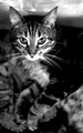
must have done somethingby posthumousComment by Melethia: Hmmm. I'm thinking I may prefer this with the grain over the Neat Image. Though I use it, I'm not a huge fan of that tool. I do like the chocolate tones. He's got a little too much of a sweetness to his expression to make it creepy or weirded out, to my eye. So no, no chocolate for you! Well, OK, maybe some later... if you're good. |
| Photographer found comment helpful. |
| 09/17/2008 12:08:52 AM |
|
| Photographer found comment helpful. |
| 09/15/2008 10:04:49 PM |
|
| Photographer found comment helpful. |
| 09/15/2008 07:04:30 PM |
must have done somethingby posthumousComment by cpanaioti: *** Greetings from the Critique Club ***
First impressions: The high key works here.
Exposure: You did well to keep a good balance between lights and darks though I feel the left side of the face is a little too light or the other side a little too dark giving the eyes a bit of a spooky look rather than natural.
Impact: High key effect I think gives this image its impact making the subject really stand out.
Composition: I thinking this may work better with a more vertical composition, hence cropping more on the right and left. One hand appears to be cut off at the wrist though not really a problem since it's behind the boy and at the point of blending into the background.
Keep shooting.
Cheers!
Colette |
| Photographer found comment helpful. |
| 09/15/2008 02:33:19 PM |
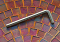
best frickin allen wrench everby posthumousComment by JuliBoc: I like the background and colors. Can't get too excited about the subject, but the image is nice. Is that one of the lamest comments ever??? :/ But I do like it as an abstract. |
| Photographer found comment helpful. |
| 09/15/2008 01:18:45 PM |
|
| Photographer found comment helpful. |
| 09/15/2008 01:03:14 PM |
best frickin allen wrench everby posthumousComment by IreneM: I think it's the best f..ing title ever ;-)) "Stuck an allen wrench in a birdbath and took pictures of it. I still don't know why". LMAO!! Sorry, but every time I read that I go into fits of laughter (hope you don't mind ;-))))) |
| Photographer found comment helpful. |
| 09/15/2008 01:48:23 AM |
|
| Photographer found comment helpful. |
| 09/15/2008 12:38:57 AM |
|
| Photographer found comment helpful. |
Home -
Challenges -
Community -
League -
Photos -
Cameras -
Lenses -
Learn -
Help -
Terms of Use -
Privacy -
Top ^
DPChallenge, and website content and design, Copyright © 2001-2026 Challenging Technologies, LLC.
All digital photo copyrights belong to the photographers and may not be used without permission.
Current Server Time: 05/11/2026 09:35:53 PM EDT.