| Image |
Comment |
| 05/10/2007 07:01:31 AM |
|
 Photographer found comment helpful. Photographer found comment helpful. |
| 05/09/2007 09:39:47 PM |
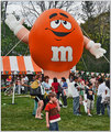
So who said M was for manners....by skewsmeComment by theSaj: I gave this a 4. Why?
I almost passed by without comment but realized this should score higher and fails to please for one reason in particular. The colors feel washed out. Like looking at a 70's print.
Just a little "hue/saturation" could really enhance this. I increased overall saturation. But especially yellow (to make the grass greener, yes you would think green would do it but yellow often works better). And red. I also hue shifted the red a bit to get a much more truer red.
It helps Mr. M stand out ;) |
| Photographer found comment helpful. |
| 05/09/2007 12:05:00 PM |
|
| Photographer found comment helpful. |
| 05/09/2007 11:33:19 AM |
|
| Photographer found comment helpful. |
| 05/09/2007 10:07:34 AM |
|
| Photographer found comment helpful. |
| 05/09/2007 08:01:47 AM |
|
| Photographer found comment helpful. |
| 05/09/2007 07:59:22 AM |
|
| Photographer found comment helpful. |
| 05/08/2007 07:56:22 PM |
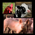
ei ei oby skewsmeComment by colorcarnival: you know, you could make a whole book of these to use for kids. I would love to have shown mine pics like these. It would have been fun. love the layout and contrasting colors. the cow's eye - that's a riot! |
| Photographer found comment helpful. |
| 05/08/2007 06:23:34 PM |
|
| Photographer found comment helpful. |
| 05/08/2007 05:09:29 PM |
|
| Photographer found comment helpful. |
Home -
Challenges -
Community -
League -
Photos -
Cameras -
Lenses -
Learn -
Help -
Terms of Use -
Privacy -
Top ^
DPChallenge, and website content and design, Copyright © 2001-2026 Challenging Technologies, LLC.
All digital photo copyrights belong to the photographers and may not be used without permission.
Current Server Time: 08/18/2026 03:24:10 AM EDT.