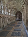
Medieval Cloisters, Gloucester Cathedralby
obsidianComment by karmat: CRITIQUE CLUB CRITIQUE
by karmat
I love old buildings like this. I look at them and wonder, if the pillars could talk, what stories would they have to tell? What have they heard and see that no one else ever has?
Compositionally, I love the "off-side" feeling of this. So many times shots like this are taken staight on with exact symmetry, and while that is nice, this composition gives it a bit more "sophistication" I think. I wondered if it might have been stronger with less foreground and cropped horizontally, BUT, I like how the vertical crop keeps everything "close' and the floor leads into the shot.
Technically, it seems to be okay to me. I am on one of the crappy computers at work, so I can tell you what I see. If it is totally off base, pm me and that will remind me to look at home on a decent monitor (this is why I don't vote at work . . .)
The focus looks just a touch off, like perhaps some graininess was unintentionally achieved during post processing, then removed afterwards. As a result, some of the windows and arches look a little artifact-y. (Again,this may just be this monitor).
Overall, this is a great shot. I think if time had permitted (and weather), a more dramatic lighting would have really upped the wow factor of this one and pushed it into the upper 6's
Great work!