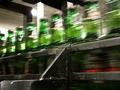
Moose Crossingby
mariomelComment by stephan: Greetings from the Critique Club, Mario :-)
Initial impact: I didn't understand the title, but now that I read the other comments I get it. Clever :-) But I don't think it's hard to recognise the objects in motion as bottles, when nto understanding the title.
Composition: Very good. I like the angle and the diagonal lines from the perspective.
Focus: The contrast between motion and stillness is great. I like how the bottles are rushing by. I think a panning shot wouldn't have worked that well.
The grain is ok. Actually I like it on this photo.
Lighting/Colours: The colours are nice. The green of the bottles vs. the brown of the machinery emphasises the contrast between motion and stillness even more.
I think it would look better without the red part of the bottles but it's not distracting. But the glare in the upper left part of the photo is.
Art: I like this photo. It conveys the motion topic very well. It's also a nice industry theme photo.
Stephan