| Image |
Comment |
| 01/31/2003 01:38:32 PM |
|
| 01/30/2003 08:30:08 PM |
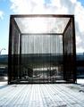
Cubedby mariomelComment by Jacko: Tha certainly is intersting. What is it? Looks like something you'd see in the movie "Hellraiser". The background is a bit too busy, but I like th main subject. Very interesting. Jacko. 7 |
 Photographer found comment helpful. Photographer found comment helpful. |
| 01/30/2003 04:55:04 PM |
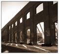
Once Upon A Timeby mariomelComment by karmat: Wonderful composition and framing. I wish you could have captured this when the shadows in the front were a touch longer. That would have added to the desolate feeling, I think. Nevertheless, wonderful capture.
|
| Photographer found comment helpful. |
| 01/30/2003 02:33:42 PM |
Once Upon A Timeby mariomelComment by Azrifel: I love the compostion of this photo, with the wall running at one angle and the sunlight on the ground at an opposite angle. It creates a feeling of sadness, of time gone by. The lonely lamps on the wall enhance that feeling. It is a shame that there are some cars in the background, but the foreground is really great.
One of my favourites. |
| Photographer found comment helpful. |
| 01/29/2003 11:10:22 PM |
Cubedby mariomelComment by PTLParsons: Beautiful. Glad you didn't crop off the shadows of the chains on the snow. That adds so much in my opinion.. Like how you can almost still see the chains at the top center where the sun almost (?) washed them out. Plain and simple but beautiful. Should be up there at the top. I give it a 9. |
| Photographer found comment helpful. |
| 01/29/2003 11:02:21 PM |
|
| 01/29/2003 10:33:09 PM |
The city no one calls homeby mariomelComment by jimmsp: Critique Club Critique
(1) COMPOSITION (CONTENT) – Very good. Sign is placed off center nicely. The city then nicely completes the photo. The relative size of the sign is very good.
(2) BACKGROUND – The city is nicely laid out with respect to the sign. The blue sky acts as good negative space.
(3) CAMERA WORK ,TECHNICAL – Focus & DOF look quite good.
(4) DIGITAL PROCESSING ,TECHNICAL – No real suggestions, looks good to me.
(5) MY OPINION ON THE PHOTO – Nicely chose sign and composition for the photo. The wording of the sign is humorous and eye catching. The major negative for this challenge would be the position of the sun and the lighting of the sign. The photo should have been taken with more light on the sign. That probably was the one item that cost you in the scoring.
Jim msp
|
| Photographer found comment helpful. |
| 01/29/2003 10:57:05 AM |
Once Upon A Timeby mariomelComment by teachme53: Nice image and I like the way the light shines throught the doors. However, the image is too dark to see all the details. If you were to go up to the wall and take your reading, (pressing down slightly on your shutter release) continue to hold down the release until you get back to were you want to take the shot. then shot the picture. Your camera will read what light it takes to get the wall and not the sky. This will give you a very satisfying photograph. I hope this helped. John |
| 01/29/2003 10:09:24 AM |
Cubedby mariomelComment by tiff: very nice the shadow ad a feeling to you image, Its kinda scary, it would have been really neat if you had put a person in the cage. Good work |
| Photographer found comment helpful. |
| 01/28/2003 06:33:07 PM |
Cubedby mariomelComment by Gracious: Very interesting textural image. Shadows are good too. The hot spot near the top of the cube doesn't enhance this any though. |
| Photographer found comment helpful. |
Home -
Challenges -
Community -
League -
Photos -
Cameras -
Lenses -
Learn -
Help -
Terms of Use -
Privacy -
Top ^
DPChallenge, and website content and design, Copyright © 2001-2026 Challenging Technologies, LLC.
All digital photo copyrights belong to the photographers and may not be used without permission.
Current Server Time: 06/11/2026 05:24:43 AM EDT.