| Image |
Comment |
| 03/30/2009 03:31:51 AM |
|
 Photographer found comment helpful. Photographer found comment helpful. |
| 03/29/2009 04:51:13 PM |
|
| Photographer found comment helpful. |
| 03/28/2009 04:13:09 AM |
|
| Photographer found comment helpful. |
| 03/27/2009 12:26:55 AM |
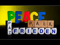
a universal prayer...by klkitchensComment by kaiser_chief: Nice idea. I like the message that oes with this. The combined difference in the different blocks used makes this even more interesting, giving colour, shape and shaddow. I like the border with it, and the yellow part of the background as well |
| Photographer found comment helpful. |
| 03/26/2009 05:20:44 PM |
|
| Photographer found comment helpful. |
| 03/25/2009 01:06:42 AM |
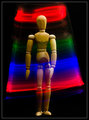
Energized!by klkitchensComment by Art Roflmao: Who doesn't love Woody?? ...ok, lots of folks. But I do and that's all that matters. ;-) Love the effect here! |
| Photographer found comment helpful. |
| 03/24/2009 08:17:45 AM |
|
| Photographer found comment helpful. |
| 03/23/2009 11:16:39 PM |
|
| Photographer found comment helpful. |
| 03/23/2009 09:11:33 AM |
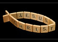
The ONLY Hopeby klkitchensComment by citymars: Kevin, I thought this might be yours. It's an exceptionally clever concept. The tiles look great against the black background. The "letterbox" frame looks terrific (I almost think they should be outlawed). :-) This would make a great poster and could possibly sell, but I think you would have to reshoot because even at this size it looks a bit soft. I'd love to really see the grain in the wooden tiles! I also felt the title was proselytizing, but didn't "deduct" points for that. |
| Photographer found comment helpful. |
| 03/21/2009 09:38:37 AM |
The ONLY Hopeby klkitchensComment by Paul: I've come back to edit my feedback here - I think my take during the challenge was a bit reactionary, so apologies for that. Granted I'm not a fan of religiously themed images but I should have put that to one side. I had commented that I didn't think that much going on photographically; probably because it didn't hold my interest due to my prejudice. On reflection, the combination of the letters and the symbol is effective; as is the framing used.
I think the lighting is perhaps a little flat and I wonder how the scene would look with low light source pointed in from the side; I would agree that some better clarity of the texture in the wood would have improved the image.
Since post my initial comments, I've been bothered my I how intolerant I must've appeared - so I have had a growing need to come back and rectify that.
There's no doubt you had a clear vision with this image and you have executed it well and reading other comments here, you struck a chord with many a member. Message edited by author 2009-03-24 17:33:19. |
Home -
Challenges -
Community -
League -
Photos -
Cameras -
Lenses -
Learn -
Help -
Terms of Use -
Privacy -
Top ^
DPChallenge, and website content and design, Copyright © 2001-2026 Challenging Technologies, LLC.
All digital photo copyrights belong to the photographers and may not be used without permission.
Current Server Time: 07/22/2026 05:39:26 PM EDT.