| Image |
Comment |
| 06/19/2006 01:11:03 PM |
|
| 06/19/2006 10:37:18 AM |
|
| 06/19/2006 05:09:14 AM |
|
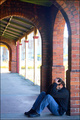
| 06/19/2006 12:23:40 AM |
Wretchedness - Feeling Blueby TajhadComment by DelRioPhoto: This one could have been really cool if you had nailed the lighting. I think the background lighting is too harsh. You might have tried to darken this one as the "wretchedness" is a dark subject. I think the time of day had something to do with it. Early morning or later evening would have been better I think. |
| 06/10/2006 10:56:03 AM |
Another-Year.jpgby TajhadComment by Jutilda: This really looks like a 1950's post card. I swear! Really nice job of post editing. I like the story it tells too. Something anybody can relate to. |
 Photographer found comment helpful. Photographer found comment helpful. |
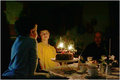
| 06/04/2006 06:04:04 PM |
Coordination successby TajhadComment by kari1: ::: Critique Club :::
Hi, my name is Kari and from the critique club.
First Impression - the most important one:
This is a lovely image, seems a little too tightly cropped.
Composition:
The crop doesn't allow the rules to apply easerly .. I am not sure but it just doesn't seem to work well .. maybe working towards the rule of thirds would have helped in the circumstance .. do a google on this and see how that helps in recropping and positioning of the people in the frame.
Subject:
I think lots of people did not get/understand the success shown .. so got a littl of the DNMC ... but I think it meets the challenge fine.
Technical (Colour and light):
Not sharp enough .. you mentioned this .. I think that the border is a little too thick and creates a tightness on the image. I like the colours they are lovely and bright.
To grow its vote?:
Think about the rules of photography .. i am not at home so don't have my normal URLs to give .. but this may help in future ... do a google and have a look around.
Summary:
Good work .. keep it up.
If you've got any questions about this critique, please feel free to contact me via
the PM system.
Cheers
Kari |
| Photographer found comment helpful. |
| 05/29/2006 11:54:22 PM |
|
| 05/24/2006 05:31:50 PM |
|
| 05/15/2006 01:15:34 AM |
|
| Photographer found comment helpful. |
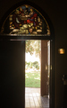
| 05/12/2006 12:56:16 PM |
The light of the Worldby TajhadComment by Nald: It's difficult to get the detail in the stained glass without loosing your detail through the open door hu? I commend you for not blowing out everything on the other side! Perhaps a bit to tightly cropped on the left but a great idea for the shot and the tones in the stained glass window are amazing! |
| Photographer found comment helpful. |
Home -
Challenges -
Community -
League -
Photos -
Cameras -
Lenses -
Learn -
Help -
Terms of Use -
Privacy -
Top ^
DPChallenge, and website content and design, Copyright © 2001-2026 Challenging Technologies, LLC.
All digital photo copyrights belong to the photographers and may not be used without permission.
Current Server Time: 06/11/2026 06:13:35 AM EDT.