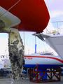
DPChallenge: A Digital Photography Contest You are not logged in. (log in or register
 
Browse Settings
Currently viewing:
Registered Userkenbo

Show comments:

Per page:

Order:

Comments:


Comments Received by kenbo
Pages:   ... [79] [80] [81] [82] [83] [84] [85] ... [99]
Showing 811 - 820 of ~988
Image Comment
Everybody, che-eee-se!
01/24/2003 01:41:13 PM
Everybody, che-eee-se!
by kenbo

Comment by DougPaz:
Nice job, good color and composition. A couple of minor problems...the glare on the top left and the table is not horizontal.
Photographer found comment helpful.
up at the ski area - usually two more degrees lower
01/23/2003 11:25:02 PM
up at the ski area - usually two more degrees lower
by kenbo

Comment by dodobird:
Yikes, that is cold! This shot has really good focus, and I love the originality, but I am not really drawn to the signs in this shot more to the scenic back drop/road/cars. I think I would have cropped the whole road out of this shot and kept with the 2 signs as this would create more visual attention to them . With a crop like that it would tend to follow the 3rds a bit more also. 7.
Photographer found comment helpful.
Everybody, che-eee-se!
01/23/2003 02:05:50 PM
Everybody, che-eee-se!
by kenbo

Comment by lisae:
Culturally very interesting! Asian cultures don't eat much dairy. The colours are bright and the photo is crisp, but that slight tilt is distracting.
Photographer found comment helpful.
Everybody, che-eee-se!
01/23/2003 11:27:50 AM
Everybody, che-eee-se!
by kenbo

Comment by Sonifo:
It is tilted, to fix it you could have put a border on it and the turned the picture slightly. good luck
Photographer found comment helpful.
up at the ski area - usually two more degrees lower
01/23/2003 08:01:48 AM
Everybody, che-eee-se!
01/23/2003 01:04:38 AM
Everybody, che-eee-se!
by kenbo

Comment by kandyj:
LOVE the way the background sky repeats the colors in the foreground.
Photographer found comment helpful.
Everybody, che-eee-se!
01/22/2003 05:28:28 PM
Everybody, che-eee-se!
by kenbo

Comment by Jacko:
Very interesting shot. La vache qui rit. (thought that was Canadian?). I like the contrasting colours. One thing I would absolutely change: rotate the shot to make the Low Fat Milk sign level, the angle is disorienting. Jacko.
Photographer found comment helpful.
yachts at rest
01/22/2003 05:01:58 PM
yachts at rest
by kenbo

Comment by Azrifel:
~~~~Critique Club Comment~~~~

Composition (content)

The composition is one of the two main reasons why this image scored 217th out of 219 entries. The other one is the fact that this is not a landscape. To enter it was your choice, I don't mind.

The rudder is in an interesting place in the composition, a rule of thirds spot and it seems to work here. The keel of the boat also enters the frame in a nice way.
The other parts of the composition are messy. The keel of the red boat seems to transfer into the bow of the boat at the right. The rudder blocks the name of the boat in the back and the bow of the boat behind "...rtner" seems to drop out of nothing (and breaks the line into the rudder of the first boat). I think that a different shooting angle would iron out most of that. More to the right for example, to get the bow and name of the "...rtner" in view and to detach the keel of the red one from the bow of other. It would also improve the depth.
The colors of the boats are nice, but on the oversaturated side.

Background
See composition. Try different angles.

Camera Work (Technical)
I own a P1 and there is not much you can do with it. :)
The exposure seems good, depth of field is huge, but when the rudder is used as main subject, it would be better with a blurred background. Just hope that the camera does it. :)
Focus and sharpness are good.

Unfortunately the whitebalance cannot be set manual, because the balance seems to favour blue. My P1 does the same thing in any outdoor situation. Always a blue/purple cast. Autolevels or manual levels with the white/black eyedropper in photoshop does magic with that.

Digital Processing (technical)
See camera work.
The maximum filesize is 150kb, yours is 100kb. Using a higher quality setting could make the sky in the upper right look more natural and keeps jpeg artifacting around noise lower.

My opinion
Needs better composition.
up at the ski area - usually two more degrees lower
01/22/2003 02:01:45 AM
up at the ski area - usually two more degrees lower
01/21/2003 11:50:29 PM
up at the ski area - usually two more degrees lower
by kenbo

Comment by kandyj:
I like the way the top sign leads to the blue sign leads to the car in front. Looks like it could have been a bit more in focus and sharp, but interesting shot anyway.
Photographer found comment helpful.
Pages:   ... [79] [80] [81] [82] [83] [84] [85] ... [99]
Showing 811 - 820 of ~988


Home - Challenges - Community - League - Photos - Cameras - Lenses - Learn - Help - Terms of Use - Privacy - Top ^
DPChallenge, and website content and design, Copyright © 2001-2025 Challenging Technologies, LLC.
All digital photo copyrights belong to the photographers and may not be used without permission.
Current Server Time: 08/17/2025 05:38:27 PM EDT.