| Image |
Comment |
| 05/26/2003 04:21:17 PM |
|
 Photographer found comment helpful. Photographer found comment helpful. |
| 05/24/2003 11:37:51 PM |
|
| Photographer found comment helpful. |
| 05/23/2003 09:18:49 PM |
|
| Photographer found comment helpful. |
| 05/23/2003 02:56:39 PM |
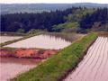
shades & shadows of May greenby kenboComment by HBunch: *Critique Club*
Hi there. While this does include some secondary colors, the only part that really appeals to me much is the reflection of the trees in the water of the field that is entirely in the photo.
The sky in the background is not very appealing, nor is the hazy fog over the farthest mountains. I think that I would prefer this if that part were cropped out, at least to the bottom of the white sky, that way we can still see the trees that are reflecting.
The focus and clarity appear to be just fine. I do like the lines of plant in each field. I think that those lines of plants look really good with the reflection of the trees.
The entire photo looks like it has a bit of a pink tint to it. Keep in mind that I've never seen these in person, but the pinkness doesn't look natural. I think this can be caused by a white ballance issue, and can usually be corrected with with post processing hue and saturation adjustments.
It's a nice scene, and with a few minor adjustments, I think it could be a nice photo too. ~Heather~ |
| 05/22/2003 11:22:56 PM |
|
| Photographer found comment helpful. |
| 05/22/2003 08:02:51 PM |
|
| Photographer found comment helpful. |
| 05/22/2003 02:34:15 PM |
tea gear patternby kenboComment by HBunch: *Critique Club*
I like this. I think that the setup is excellent. The angle and framing/cropping is near perfect. If I had to make a suggestion on that aspect, I would say to crop the yellow bowl differently, maybe closer to the middle of the bowl. However, I would not want the symbols cropped at all.
The lighting seems to be a problem for me. I think that the image appears too dark, especially near the upper left and on the yellow bowl. There is shadow in the upper left creating some extra darkness. I think that had there been some extra lighting that the colors might punch a bit harder. Maybe even jump right out of the screen. lol
Since you photographed glass subjects, extra lighting would also mean extra lighting control so you wouldn't get annoying glares on the glass.
Your focus and clarity are good. I like the detail in the dishes. You have done a great job with this.
~Heather~ |
| Photographer found comment helpful. |
| 05/20/2003 09:47:12 AM |
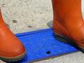
complementary colors' encounterby kenboComment by joshua: even though this composition appears intentional, it still holds a lot of snapshot feel to it. also i don't know if you are trying to say anything in this photo or if it is a random meeting of the colors. also the orange doesn't really seem all that orange...3 |
| Photographer found comment helpful. |
| 05/20/2003 06:13:45 AM |
complementary colors' encounterby kenboComment by hawkida: I like the idea but my eyes are drawn to the middle of the picture which is largely empty. Perhaps a shot of one boot on the blue metal would have worked better. |
| Photographer found comment helpful. |
| 05/19/2003 07:06:47 PM |
|
| Photographer found comment helpful. |
Home -
Challenges -
Community -
League -
Photos -
Cameras -
Lenses -
Learn -
Help -
Terms of Use -
Privacy -
Top ^
DPChallenge, and website content and design, Copyright © 2001-2026 Challenging Technologies, LLC.
All digital photo copyrights belong to the photographers and may not be used without permission.
Current Server Time: 07/17/2026 06:41:38 PM EDT.